Creating THAT Portfolio | @architorture
It’s February, which means it’s that time of the year where most of us are working on our portfolios for deadlines and submissions.
We wanted to deliver an informative post to help you lay out your portfolios, following from our portfolio post last year, but since we are only just third years, we reached out to a more experienced individual who can dig deep into the topic of portfolios and provide some solid advice. The architorture was kind enough to delve into the topic of laying out the ideal portfolio having seen many portfolios in the past.
A bit more on our guest who is joining us today:
The architorture is an education platform that aims to help and motivate architects and young creatives interested in architecture during their professional journey. You can find resources like tutorials, templates, 1-1 mentoring, advice on improving your portfolio, help with your next architecture job or useful productivity hacks all of which can be found at www.thearchitorture.com.
Imagine the following scenario:
You are an architecture graduate, and you are getting ready to apply for your first job. You are bummed out because your friends who graduated in other subjects have received a lot of job offers whereas you have searched for architecture jobs and found only a few relevant openings in your local area. Your parents tell you to send out as many applications as possible so you don’t miss any opportunities. In the end, you feel tired and frustrated, because all those applications yield no response from employers.
You're not alone with this problem; there are a lot of architecture graduates looking for opportunities without much luck (according to statistics). In order to beat the competition, you must have an interesting portfolio that is relevant to the industry's needs in 2021.
So let’s start from the beginning, the cover.
1. Creating a killer cover or creating a cover that can kill YOU?
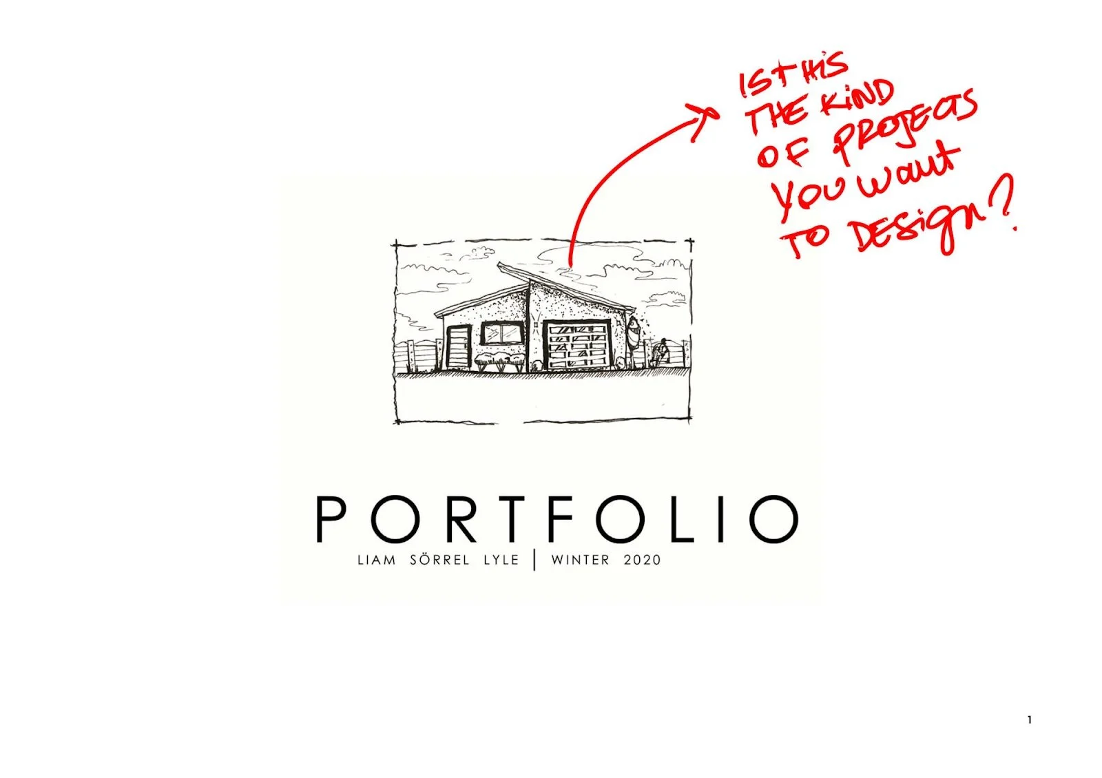
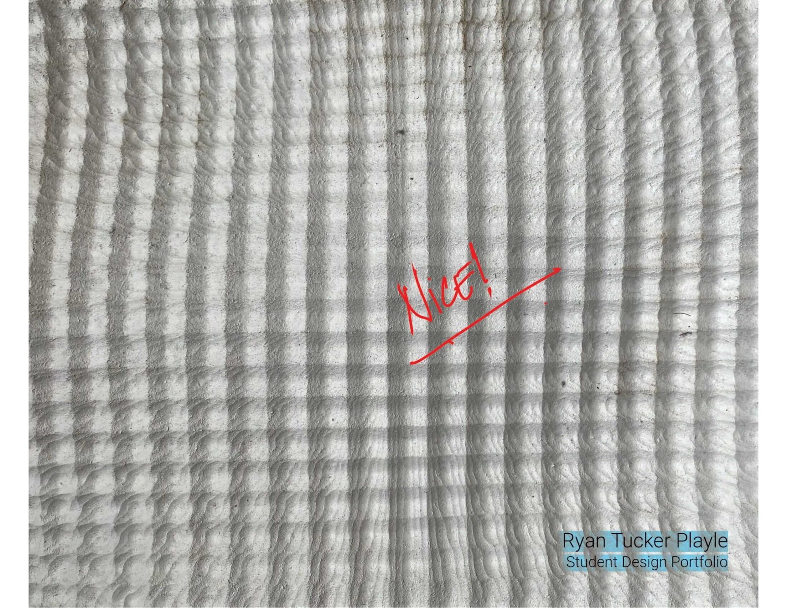
You may think the cover doesn't seem to matter all that much, but it does. It may sound confusing, but bear with me as I explain: When someone looks at your portfolio, the first thing they will notice is the cover. It is critical that your portfolio looks professional and has a clean design. Stay away from distracting backgrounds, make the text simple and visible, avoid too many types of fonts and colours. Here is a tip: When in doubt, keep it simple. It's impossible to go wrong with that. Going too far can easily lead to a blunder and If you do prefer to go insane, make it a fantastic hot mess that even Rem Koolhaas would enjoy.
2. Your Portfolio after the Cover
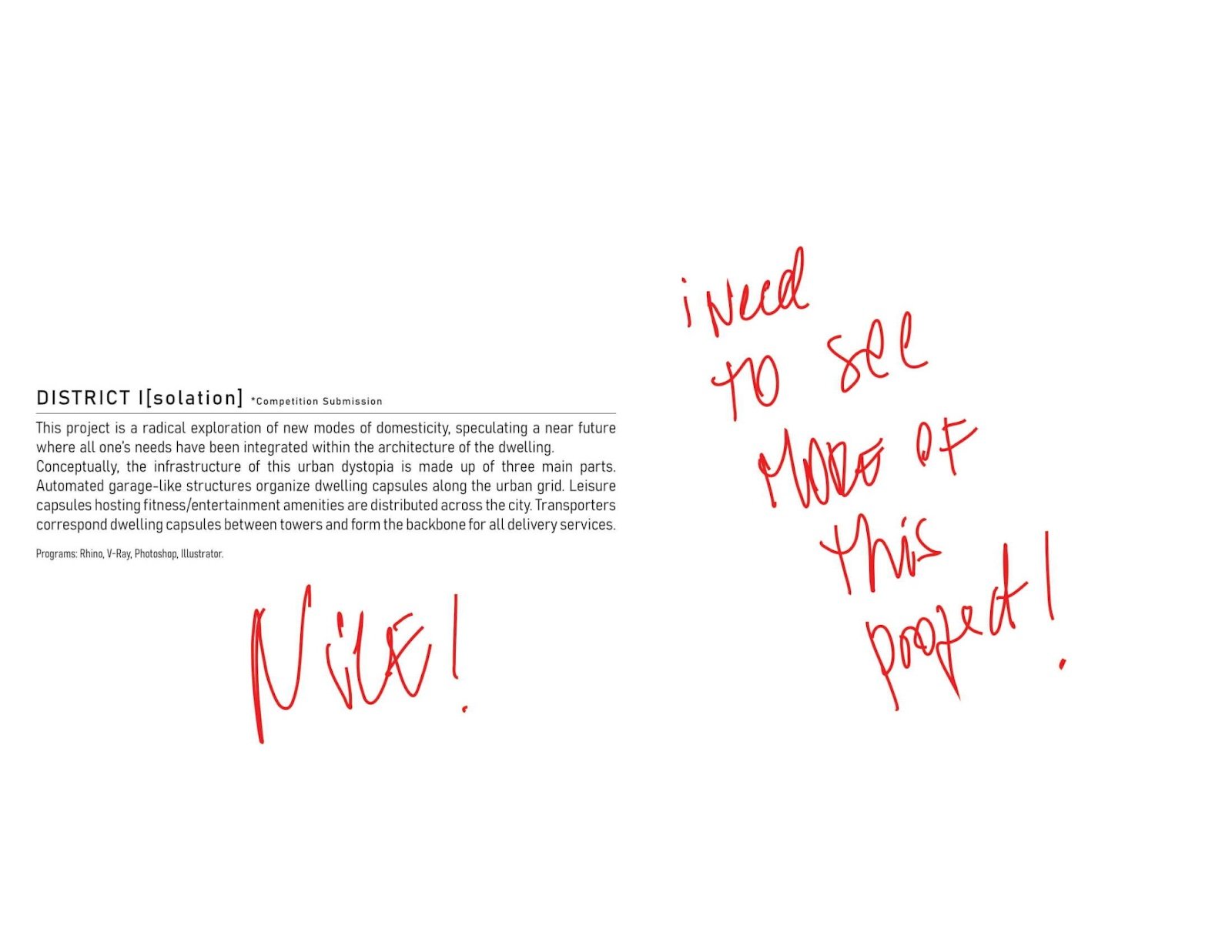
Great! You have the attention you need, and people are looking inside your portfolio. 5 points to Ravenclaw! Now please be brief, don’t add 5 pages in between the cover and your projects with quotes, blank pages, etc. The mystery is not well received when architects are reviewing portfolios. You want to get to the juicy stuff sooner rather than later.
3. Should I include a CV or Resume page?
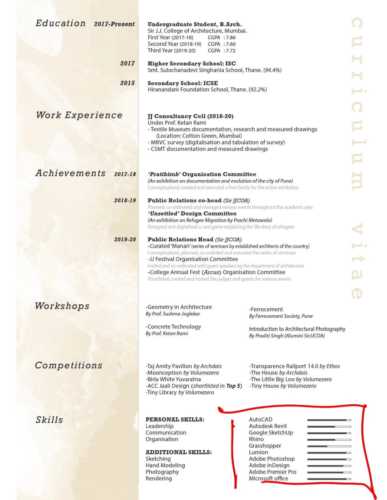
It is always good to have a resume page in your architecture portfolio. You can include an overview of your qualifications, skills, awards, and any projects you've worked on. It's also good to make it clear what you're looking for, like a specific position or project. Including a resume page in your portfolio is the best way to show off all the things you can do and would be perfect for people who are looking for a new job opportunity.
Note: Please! Please! Do not add stars to rank your AutoCAD skills, stars on your resume page are NOT welcome. (I'm talking to you Jason). Just add how many years you have used each software. I'd love to discuss this further; I'll do so in another post!
4. Project Selection: Choose your Hits
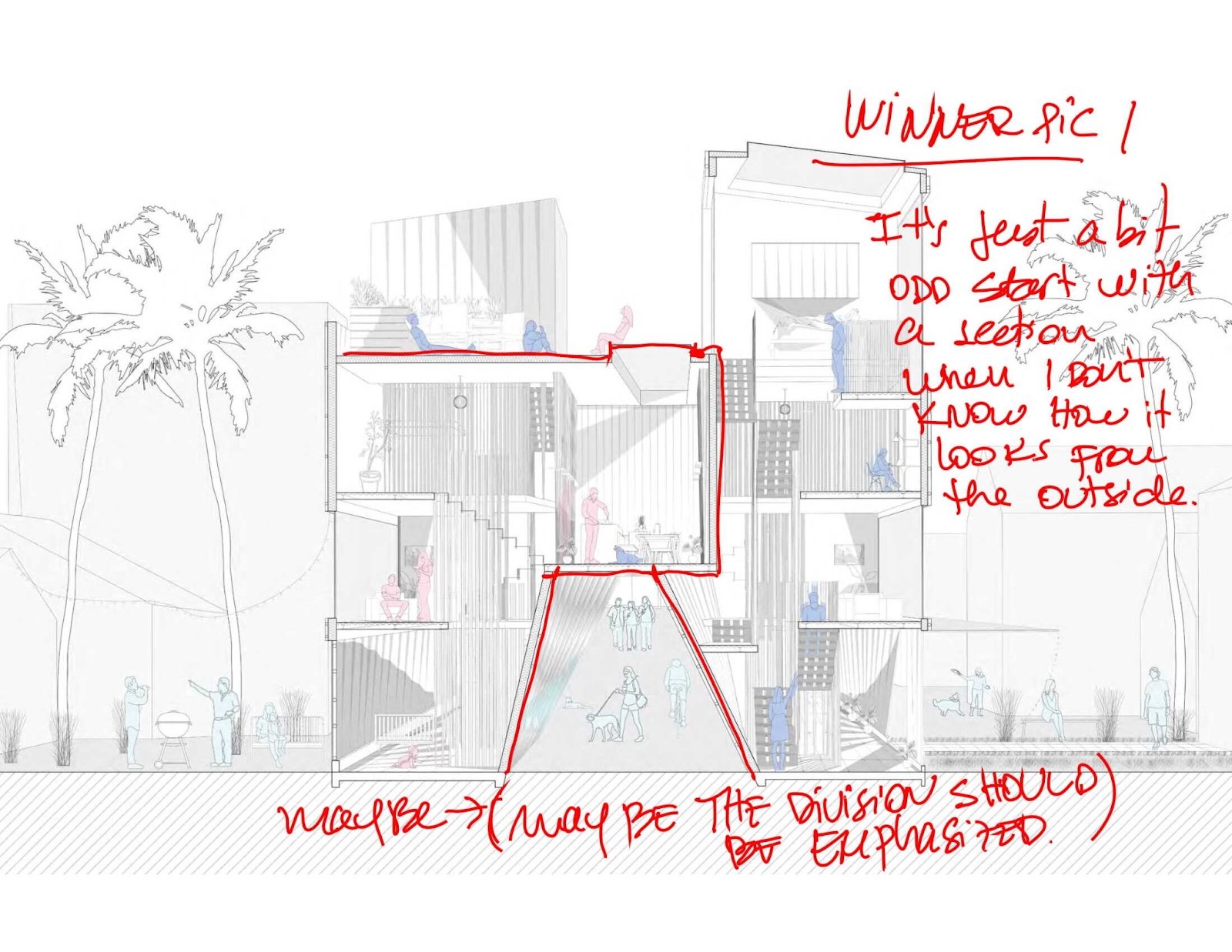
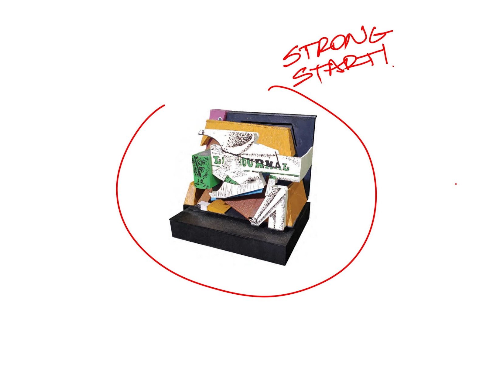
I always like to say that a portfolio is like a music album, you've got the cover, the tracks, and the hits. It is important to be selective when choosing projects to include in your portfolio. You should not add content that you don't feel confident about or that doesn't showcase your skills. The projects in your portfolio should show off what you can do and what sets you apart from other designers.
5. Project Description: Be Factual
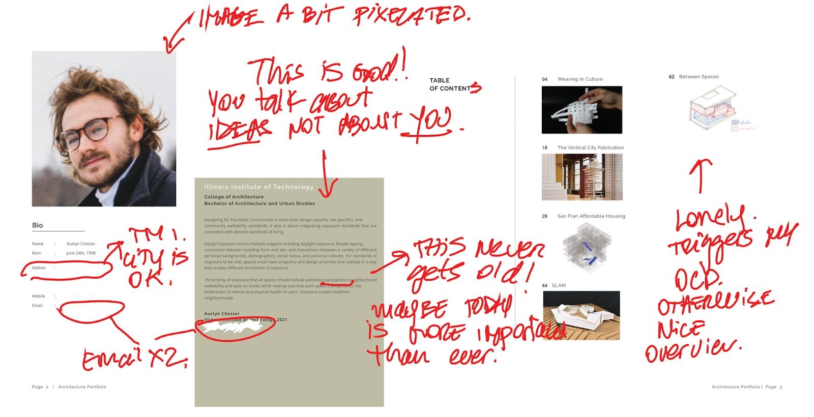
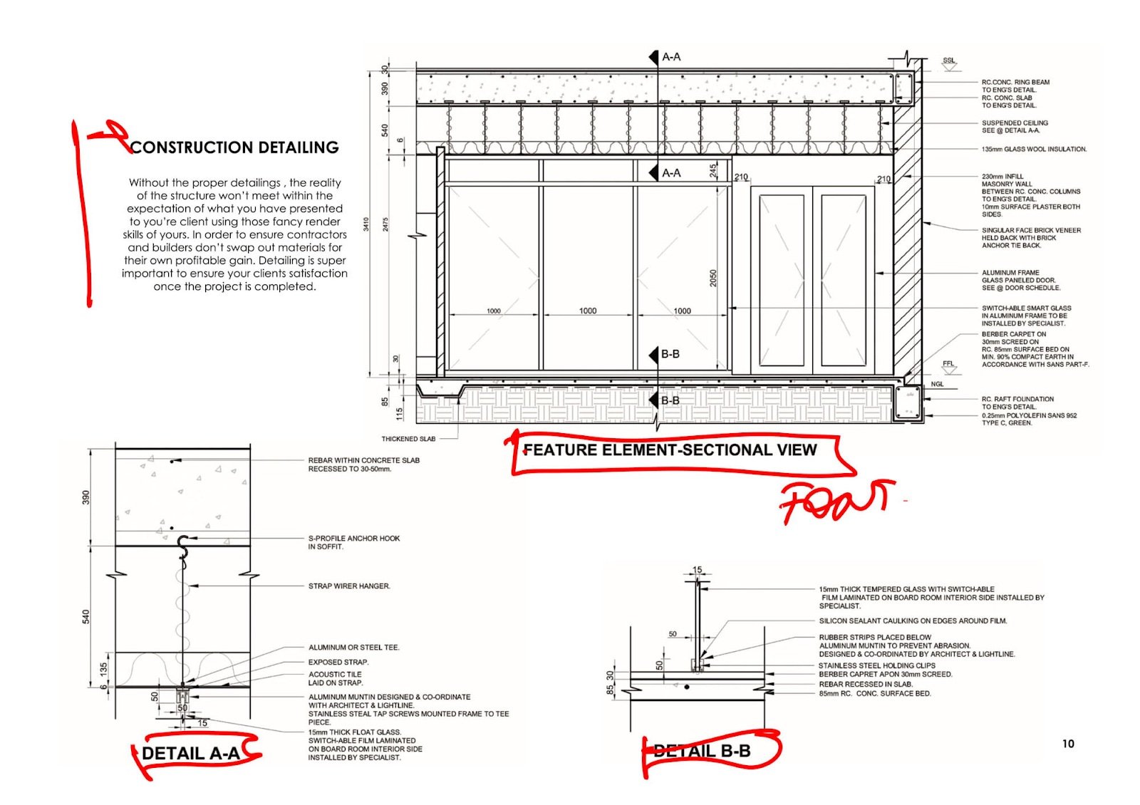
A good project description should be objective and fair. Typically, it describes the problem and how the design solves it. I wouldn't get too personal in the project descriptions; you can do that in your CV's personal statement. Check out how ArchDaily or Benoy describes projects on their website. It's pretty straightforward.
Design Challenge → Idea→ Design Solution
Extra tip: I would add solid facts, like date, client, year, square meters, location, etc.
6. Narrative: Concentrate on telling an Interesting Story
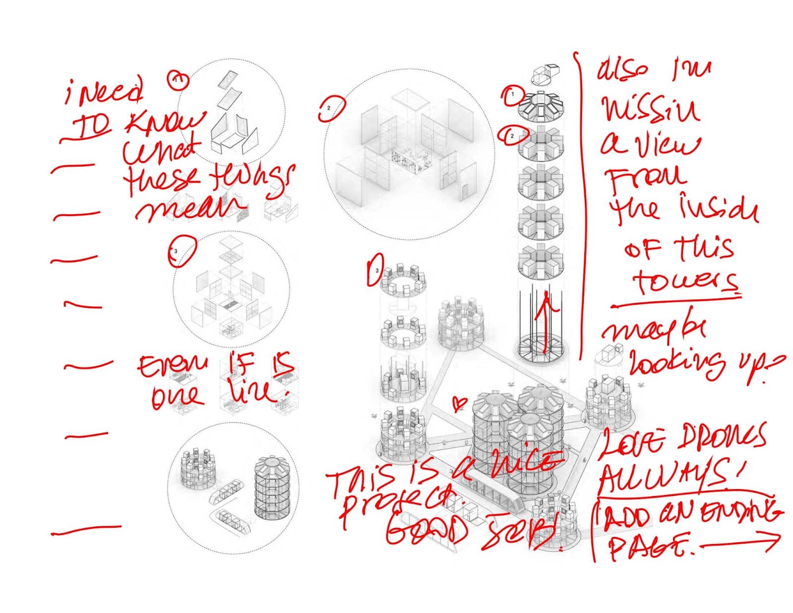
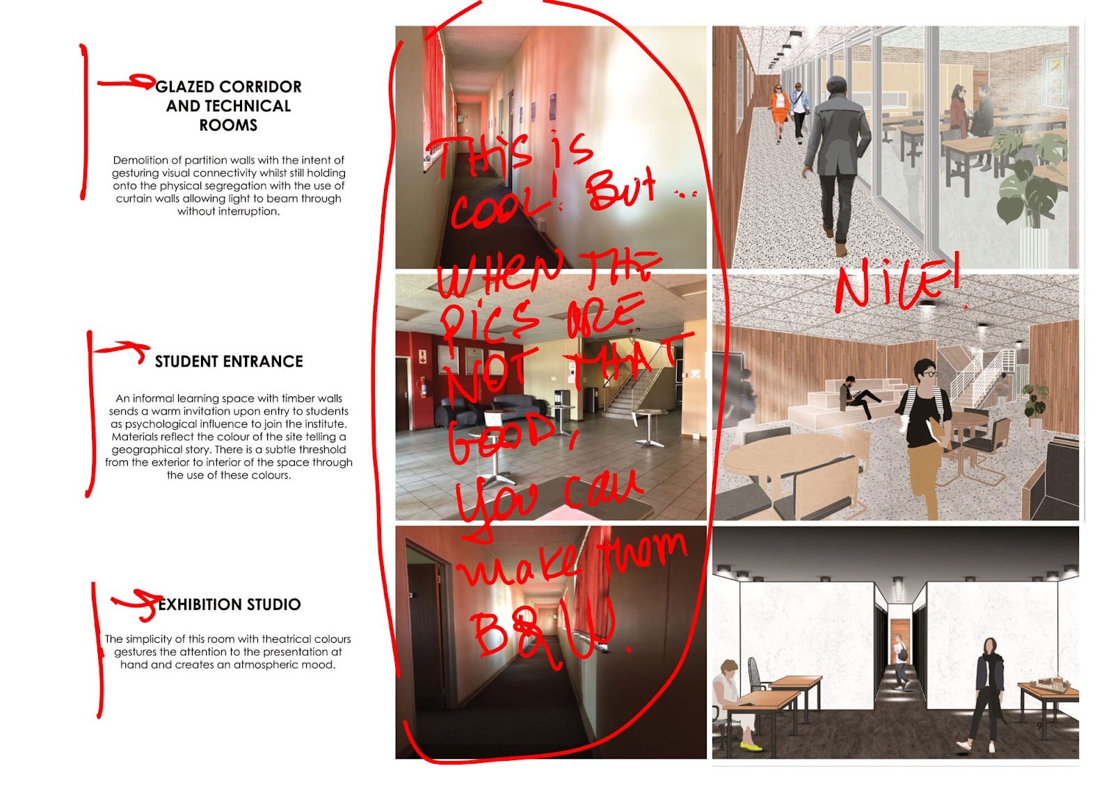
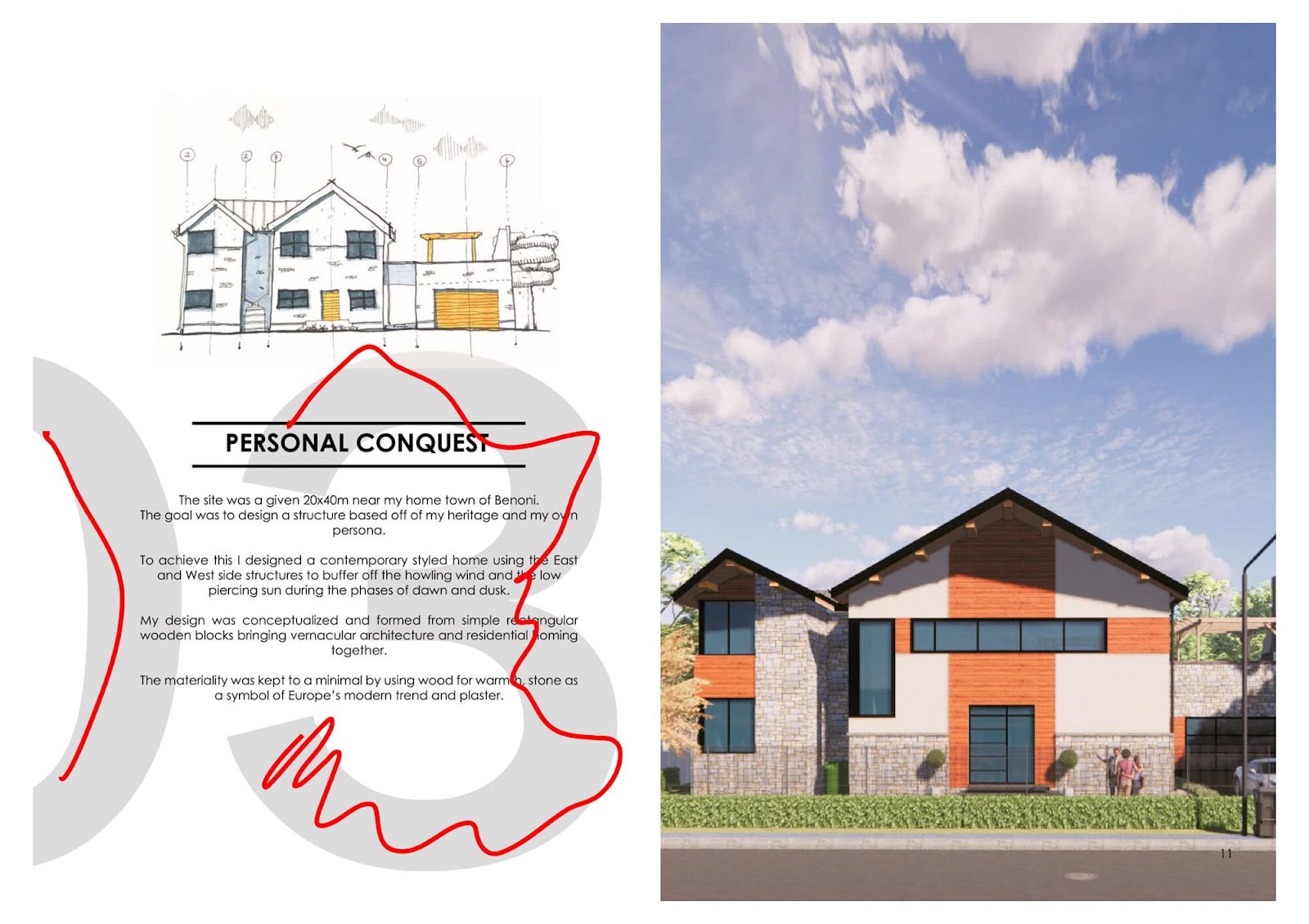
You're telling a story, just like a music album, and that story is your journey as a designer. You were born with the gift of creativity, and you can make something out of it, even if it's short or not particularly the best at times. Make the pages flow naturally, check the transitions between projects, make sure it isn't boring, and include moments where people can enjoy a visual treat. The way you present your work, whether it's through visuals, diagrams, or drawings, will play an important role in getting that call back from a recruiter. This is where the narrative element of a portfolio becomes very important. As a designer, it's crucial that you have a coherent narrative across all mediums to paint an accurate picture of who you are and what you do best. The story of your portfolio basically tells the other person why they should choose you.
7. Consistency: Maintain Visual Communication
We all know the feeling. You're scrolling through your Instagram feed and you come across a post that sticks out like a sore thumb. It doesn't match the colour scheme of the rest of your feed, or it has an inconsistent grid. It may even use different fonts, sizes, and colours5. The same thing can happen in architecture portfolios when designers are trying to show off their work. You end up with inconsistency and therefore the work is not cohesive. But how do you make sure your portfolio matches?
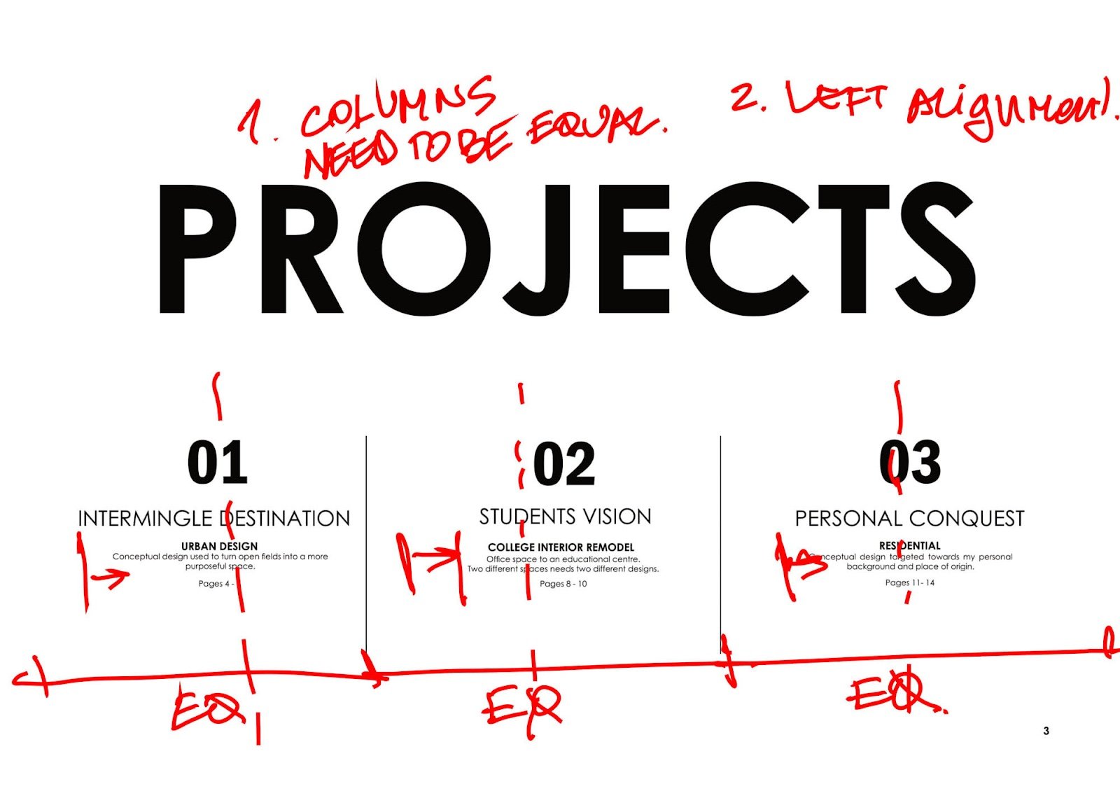
First off, make sure that there is some level of organisation to the layout. Make sure that everything is on a grid and that elements such as font size, colours, etc, are consistent throughout your portfolio. A consistent design will make your portfolio more appealing to the viewer. These are some of the ways in which you can create a consistent design.
For starters, it is a good idea to have consistency between all of your fonts and font sizes. You should also maintain a consistent layout throughout your portfolio. What this means is that you should be using the same order for all of your content, such as including an introduction page, then having a few samples, and concluding with contact information and policies. I recommend not going wild with fonts. Usually if you Google “best free Google font pairs”, it should set you to success. It’ll look nice 90% of the time. If not, it’s probably because you tried too hard to make it look bad! Just kidding, just kidding! Don’t fall in the trap that your typeface “needs to look architectural”. I would also never advise to do it handwritten unless you’re a pro, then go ahead.
8. The Layout:
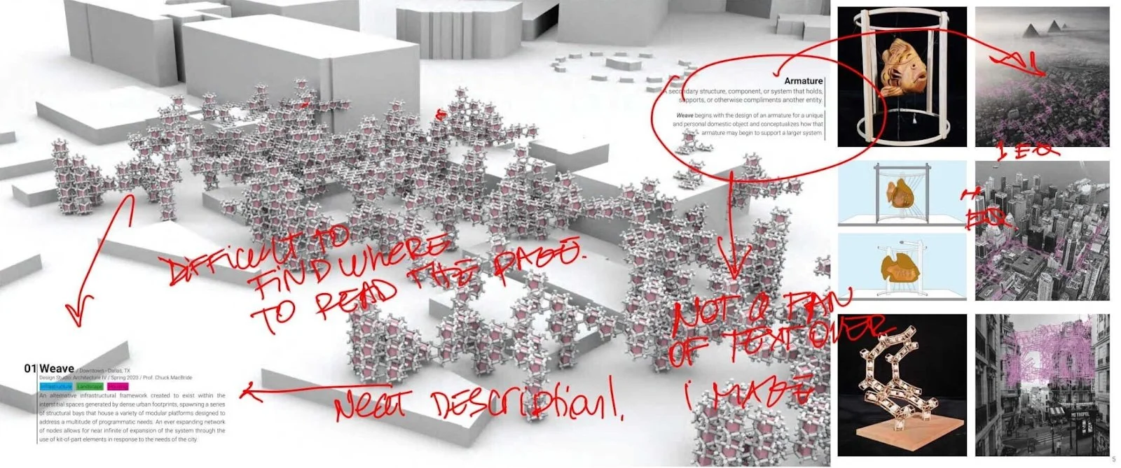
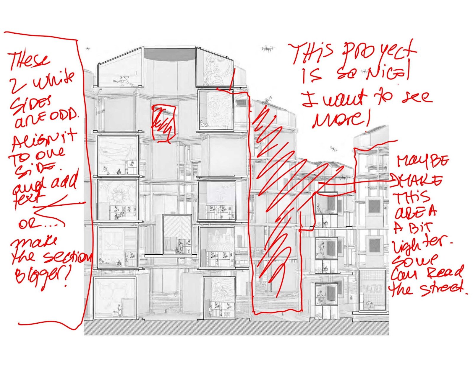
The design can be kept as simple as possible. And it appears that this is the most difficult part. Don't feel bad if you aren't a good graphic designer; there are some great architects who aren't either. At the end of the day it is another job! You can only try to learn as much as you can, ask for assistance, or use online templates to work around. I see a lot of portfolios that rely too much on visuals than they should and make them unnecessarily complicated. Great work strays away from these trends and focuses on simplicity. A good layout should make sure that people don’t have to skim through pages of your portfolio just to find what they’re looking for, only to get bored. The work should be the focus, so make sure it stands out and is easy to find. Here are some key elements that can help your portfolio layout:
Negative Space - Remember to clean up the clutter. Negative space is often used in design as a neutral background for the main subject.
Balance - This refers to the proper distribution of the visual weight of objects, colours, textures, and space. A balanced arrangement of important details.
Colour - Colour choices should be properly considered and should also compliment the visual appearance you are envisioning as it can sway thinking, change actions, and cause reactions.
Contrast - Contrast is an important tool for your design because it helps you organise and establish a hierarchy so that people can understand what your design is communicating.
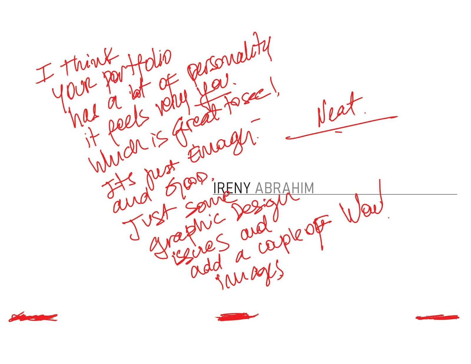
Emphasis - You should draw your viewer’s attention to a specific design element that is significant to your idea, work philosophy, or design process. Make people go WOW! at some points.
9. The Document: Print Portfolios are Over
Paper portfolio days are over. The portfolio should be in PDF format, which is the best and most common type of file that people expect to receive by applicants. The file should not be too large and the images should not be pixelated. A tip to reduce size is make sure all your line diagrams are vector files. Also, are you using InDesign? If not, you can use other alternatives but InDesign will always be my favourite. Here is why:
InDesign is the best software to create neat layouts. It is a page layout and design program that lets you create brochures, newsletters and other print materials. To use InDesign, it is necessary to have an Adobe Creative Cloud subscription or the free trial version that can be downloaded from the Adobe website. Alternatively, you can use Powerpoint or Canva.
10. What makes you unique?
Think about what you can bring to the table and what makes you special.
Are you planning to apply to graduate school in the United States? But you're from South America? Great! Show your USP (unique selling proposition). A unique selling proposition (USP) is a marketing strategy that allows you to distinguish your product or service from the competition. The primary goal of USPs is to inform your customers or potential employers about what you can bring to the table. You need to persuade them that this is the best option and that no other option will be as beneficial. In that case, don't be afraid to show off what makes you unique, to celebrate it, and capitalise on it.
11. The Last Rule: Break the Rules
The last rule is to break all of the other rules. The easiest way to get your creative juices flowing is by disregarding everything you know and just going for it. Just be aware that you are taking a risk, but also that sometimes risks are worth taking.
I hope these tips have been helpful, and cannot wait for you to share with me your results. You can reach me @thearchitorture on Instagram.
Keep killing it.
Seb.
The architorture.
We want to say thanks again to Seb for this jam-packed guide on portfolios. As much as you may find answers to almost all questions online, it is very hard to get an in depth insight into what employees are looking for by applicants.
Make sure to take advantage of all of the resources mentioned earlier that are accessible on the architorture platform. Something to definitely check out is the ‘Ultimate Portfolio Checklist’ by architorture, which is free to download at www.architorture.com
Additionally check out all the Instagram content by Seb over at @thearchitorture too!

