
A Master Plan
Hello everyone! It’s Sude tuning in this week with a tutorial in store for you all. With the help of a youtube video by @learnupstairs I have written up a walkthrough on creating a master plan for the initial part of a project.
By joining forces with Google Earth Pro and Photoshop, get ready for this insightful tutorial which includes many useful shortcuts and features that I was unaware of beforehand. Especially the power of the hue/saturation adjustment layer tool along with blending options.
Let’s begin!
1. Generating a Map
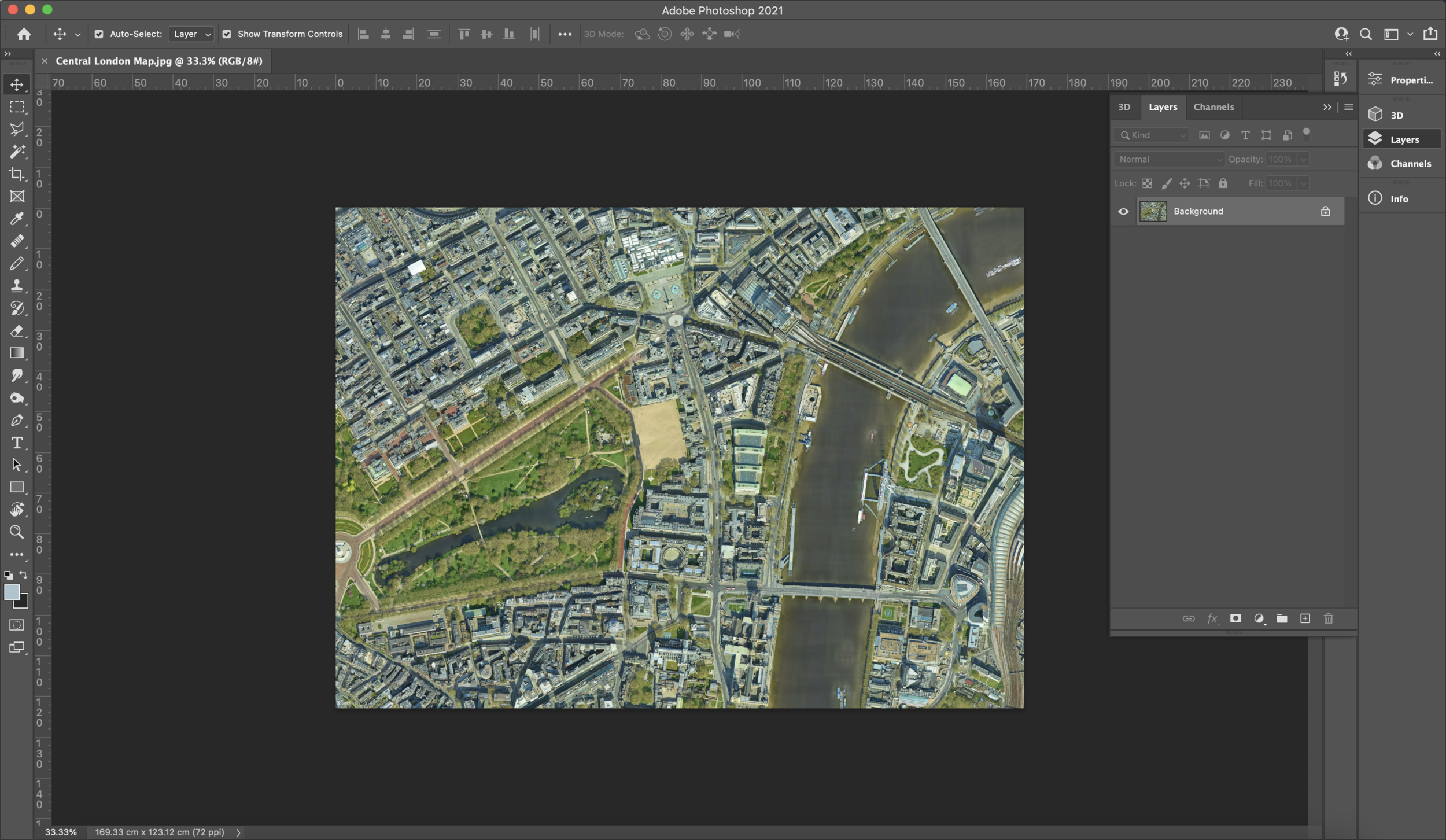
If it wasn’t self-explanatory in the title of this blog post, in order to create a master plan we need to generate a map. This can be a map from Digimaps if you want your master plan to be simply made up of lines or it can be a satellite image. The whole tutorial can also be applied to a vector based line drawing of a map too depending on your own preference but for this blog post, I will be opting for a satellite image generated through Google Earth Pro. I use Earth Pro because it generates more crisp and rich images which is necessary since quality is something that should be kept high in your work. It would be a shame to weaken a project or a page purely because of low quality images.
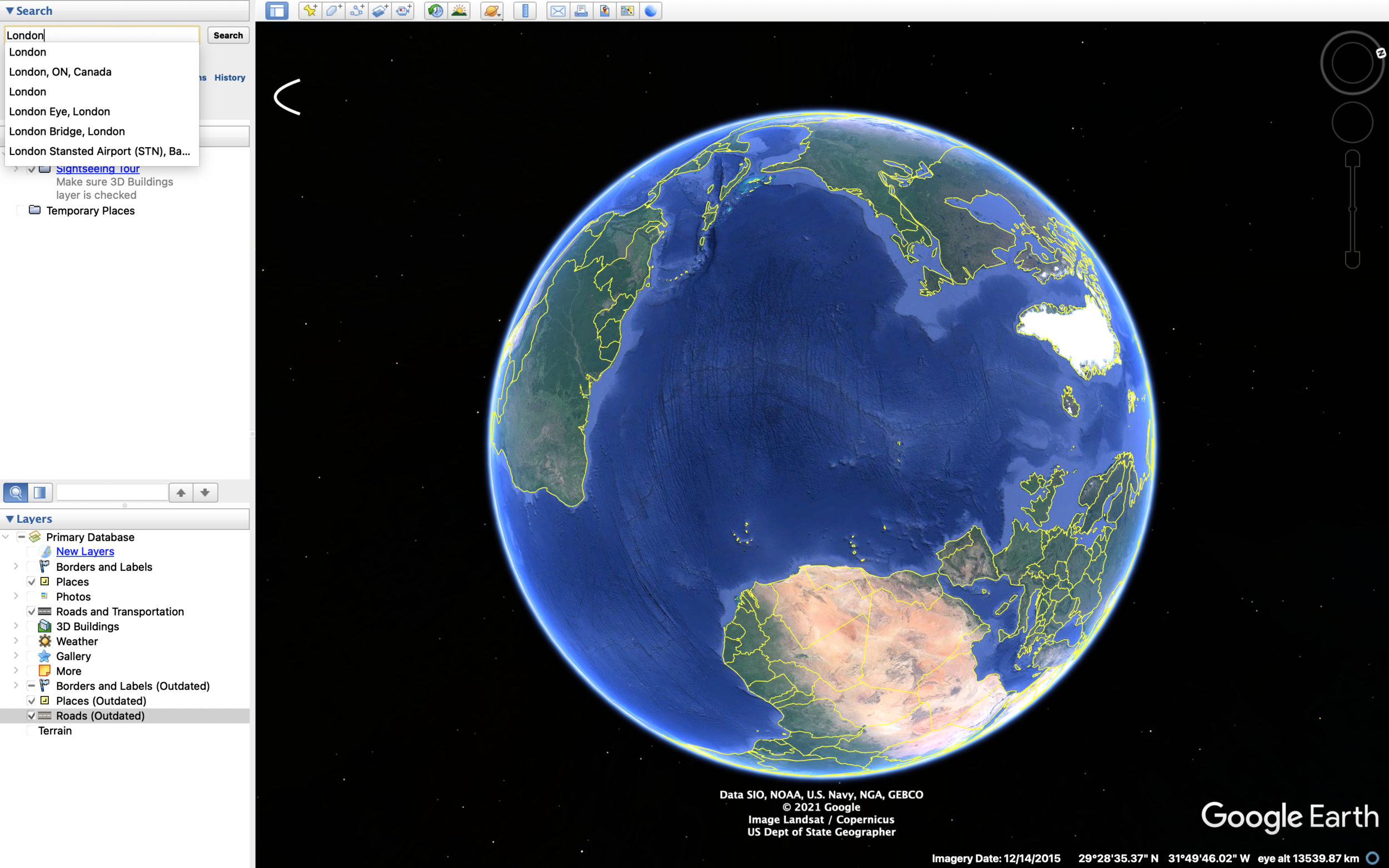
Google Earth Pro is downloaded onto your desktop/laptop unlike the Google Earth Web version. There are many more site analysis-esque filters in the program which can be very helpful for further research. Today, we won’t need to have them on besides the ‘terrain’ layer. In the top left corner, you can search for your site in order for the program to bring you to the exact location. Using the camera features in the top right, make sure to have set your camera to a plan view. When you jump straight onto the program, it tends to automatically view the earth at an angle. To do this, hold the down arrow below the eye icon until it stops which means we are perpendicular to the earth image. Set your image to north by clicking on the ‘N’ button right above the 4 arrow options. From here you can zoom in or out as much as you want until you are happy. A shortcut to move your camera angle to plan with the north facing up is by pressing the ‘R’ key on your keyboard to reset the view.


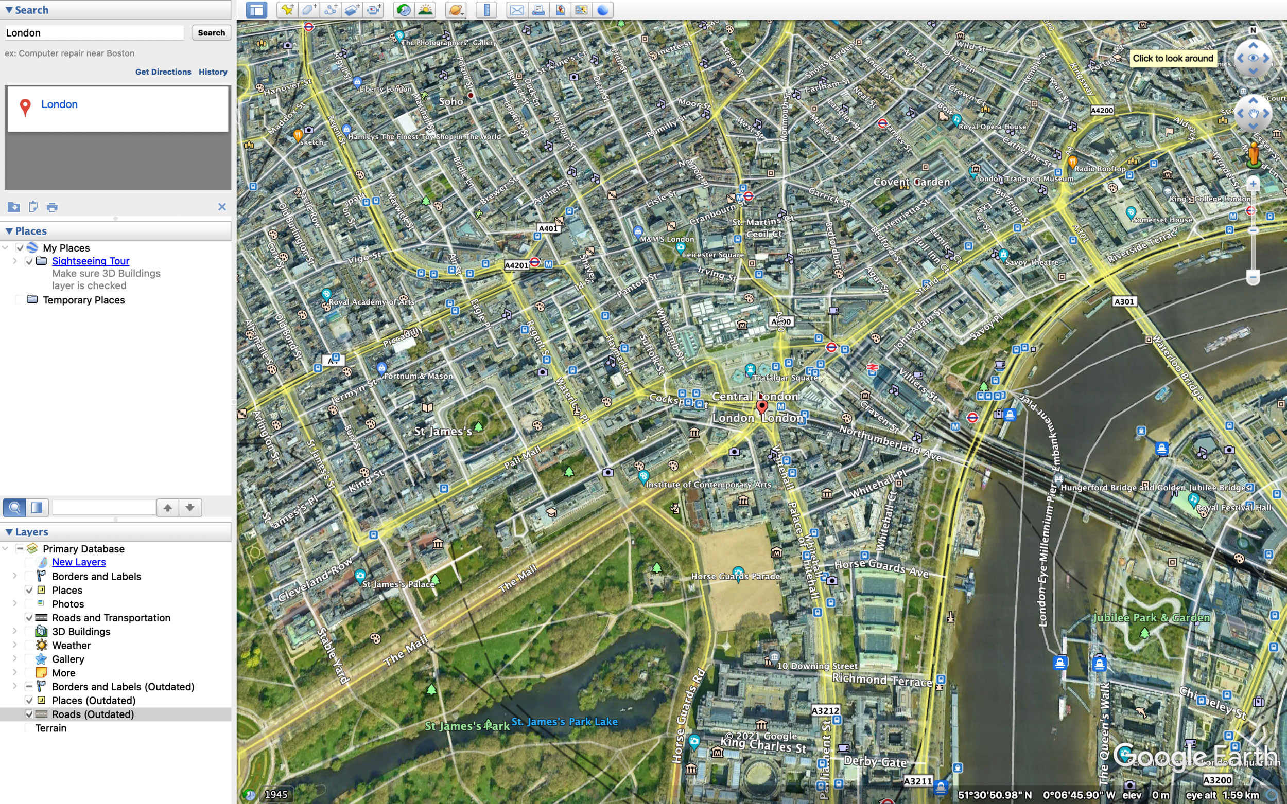

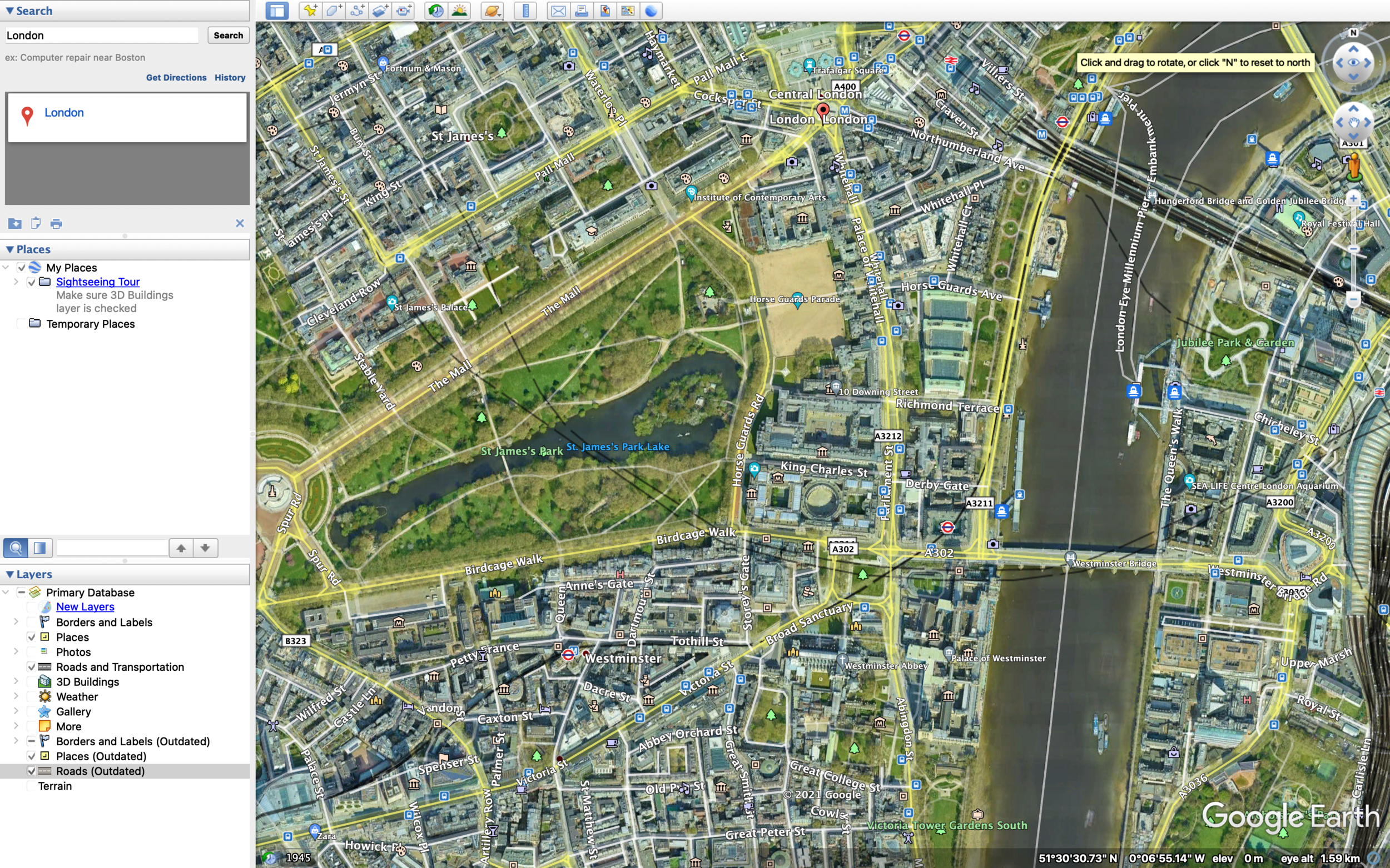

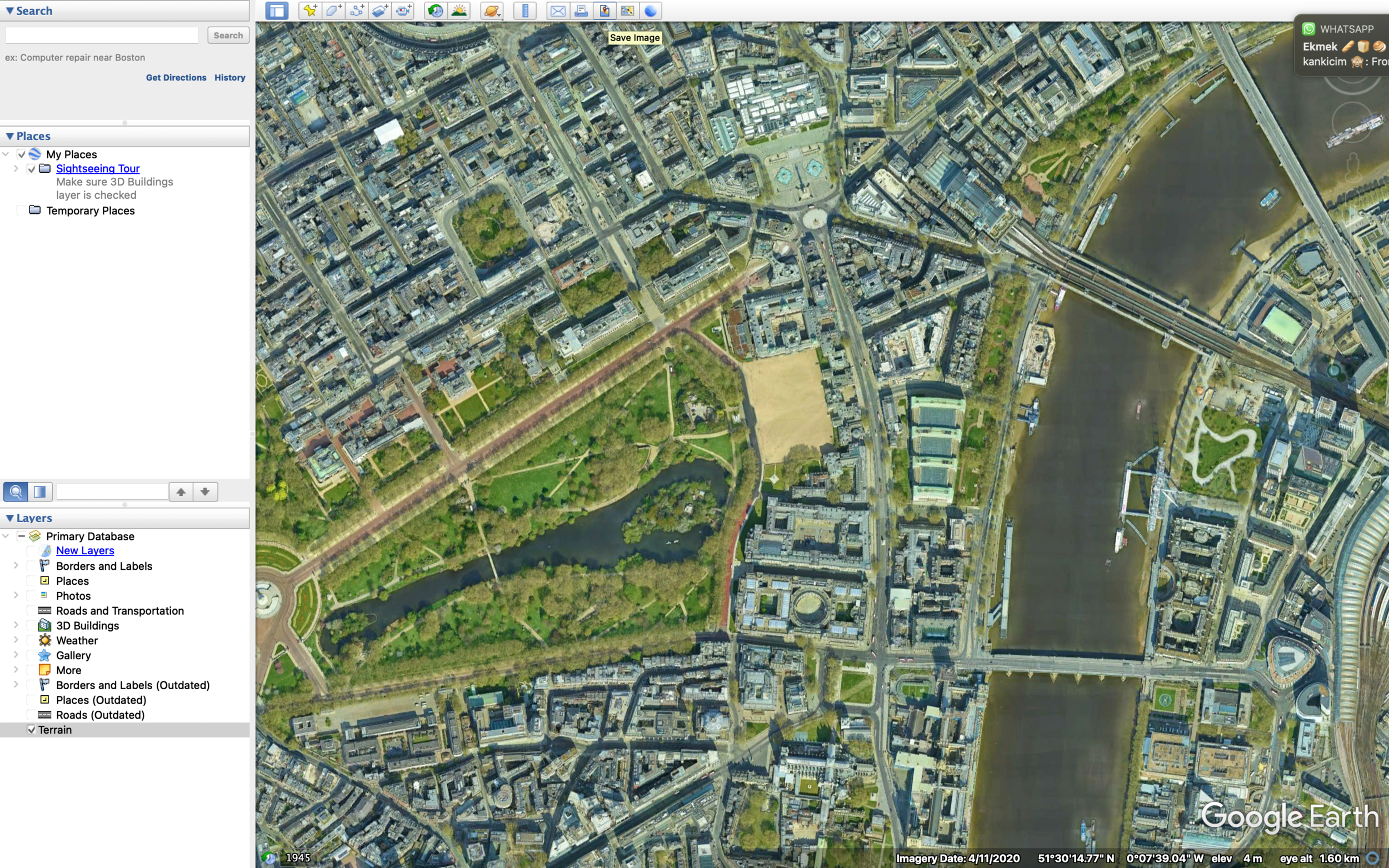


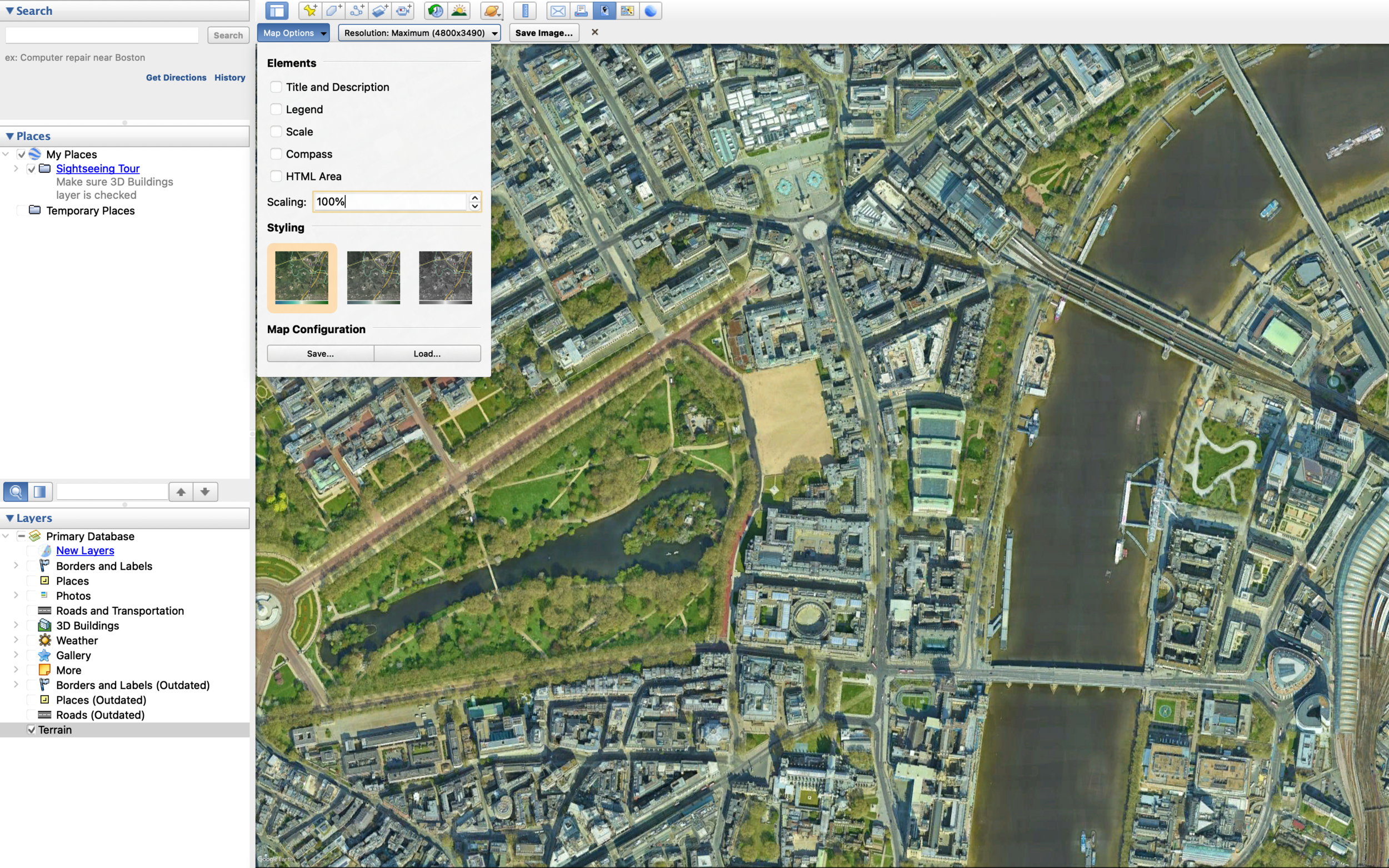

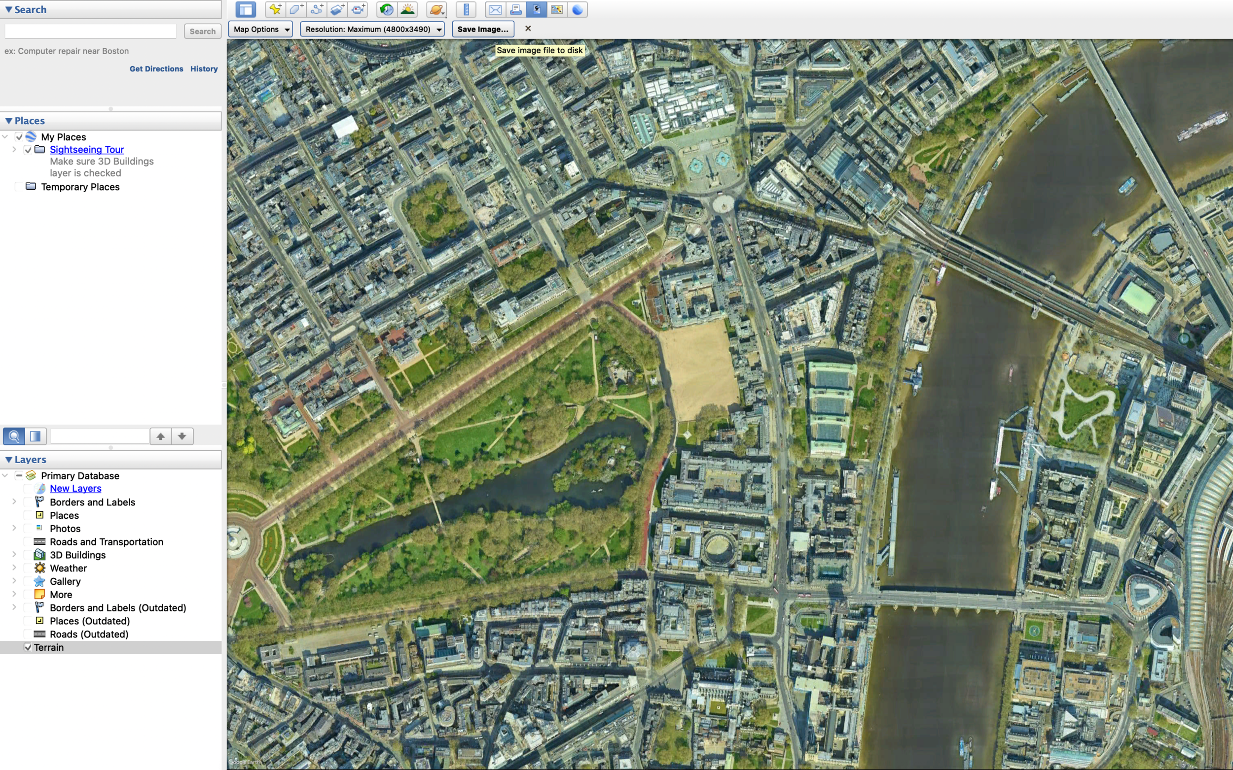
When it comes to generating the map image, it is extremely simple. As you can see from the series of screenshots above, there is an image icon at the top which allows you to save the view you are currently in as a JPEG file. If you click it, you will have options to make it less saturated or black & white. You can also decide if you would like to remove things like the scale, compass and so on. Since a master plan isn’t usually referred to when it comes to scaling, I’ve opted to leave it out and I have also unchecked the compass and title + description options since I tend to add those in myself later on. Though it is up to you on what you would like to include. I would also suggest selecting the maximum resolution.
2. Importing into Photoshop
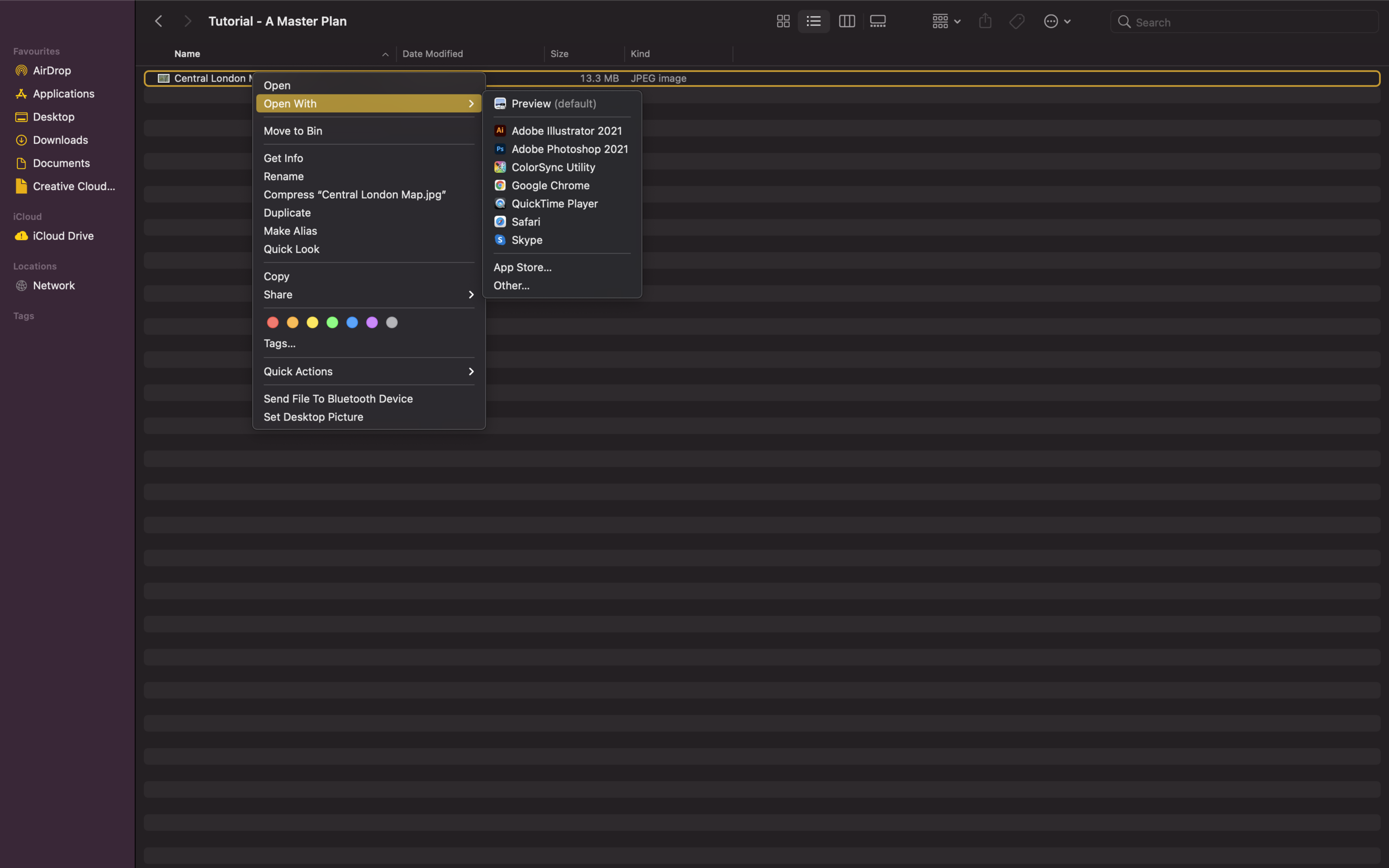
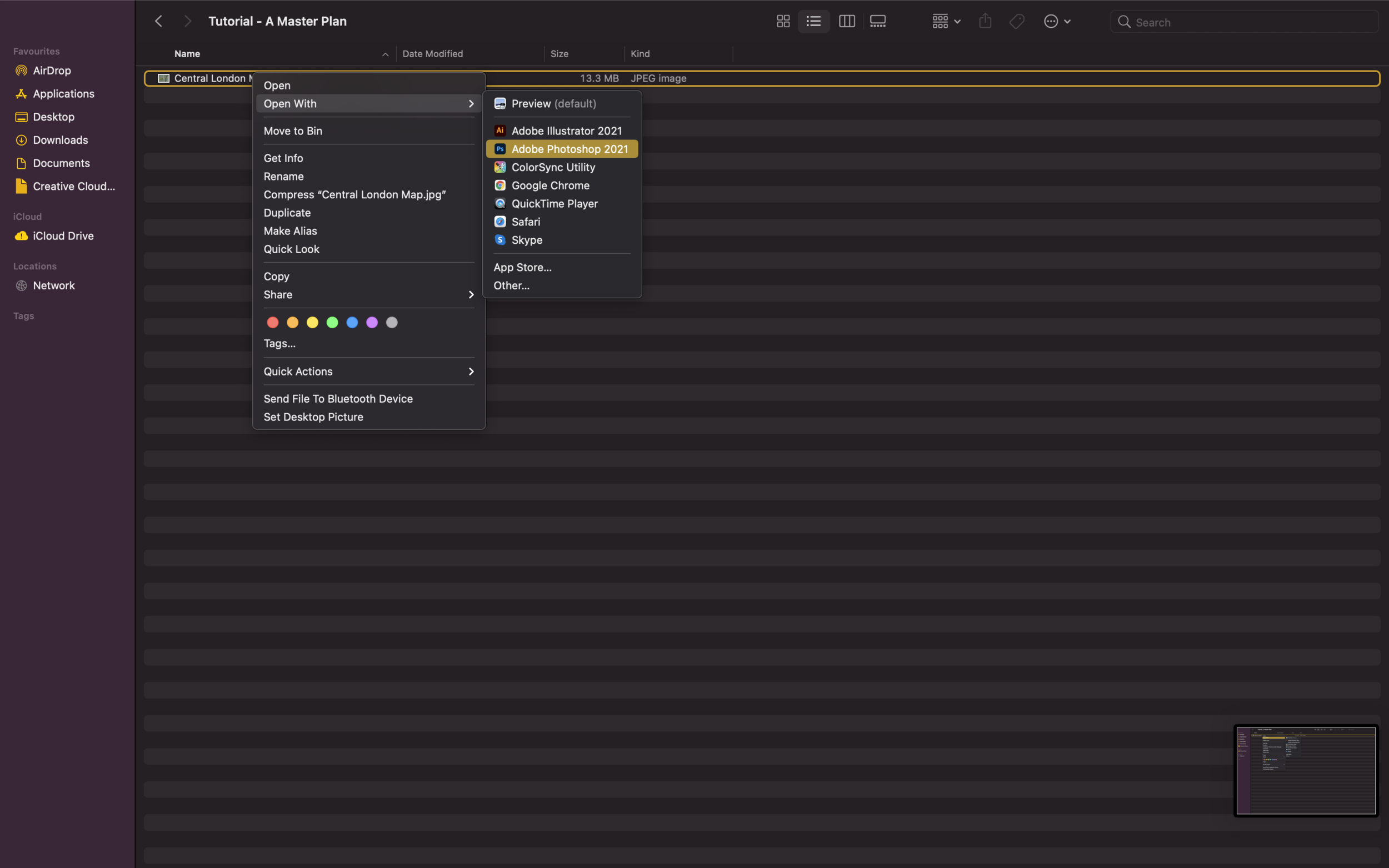
Some students have a tendency to drag and drop their JPEG files onto a new photoshop document. To save ourselves from accidentally lowering the quality of your image, choose the ‘open with…’ option to open the JPEG with Adobe Photoshop through your folder. The program will pick up on the high resolution that we had chosen in Google Earth Pro which may be lowered in certain document set-ups.
3. Enhancing Roads, Green Spaces + Water
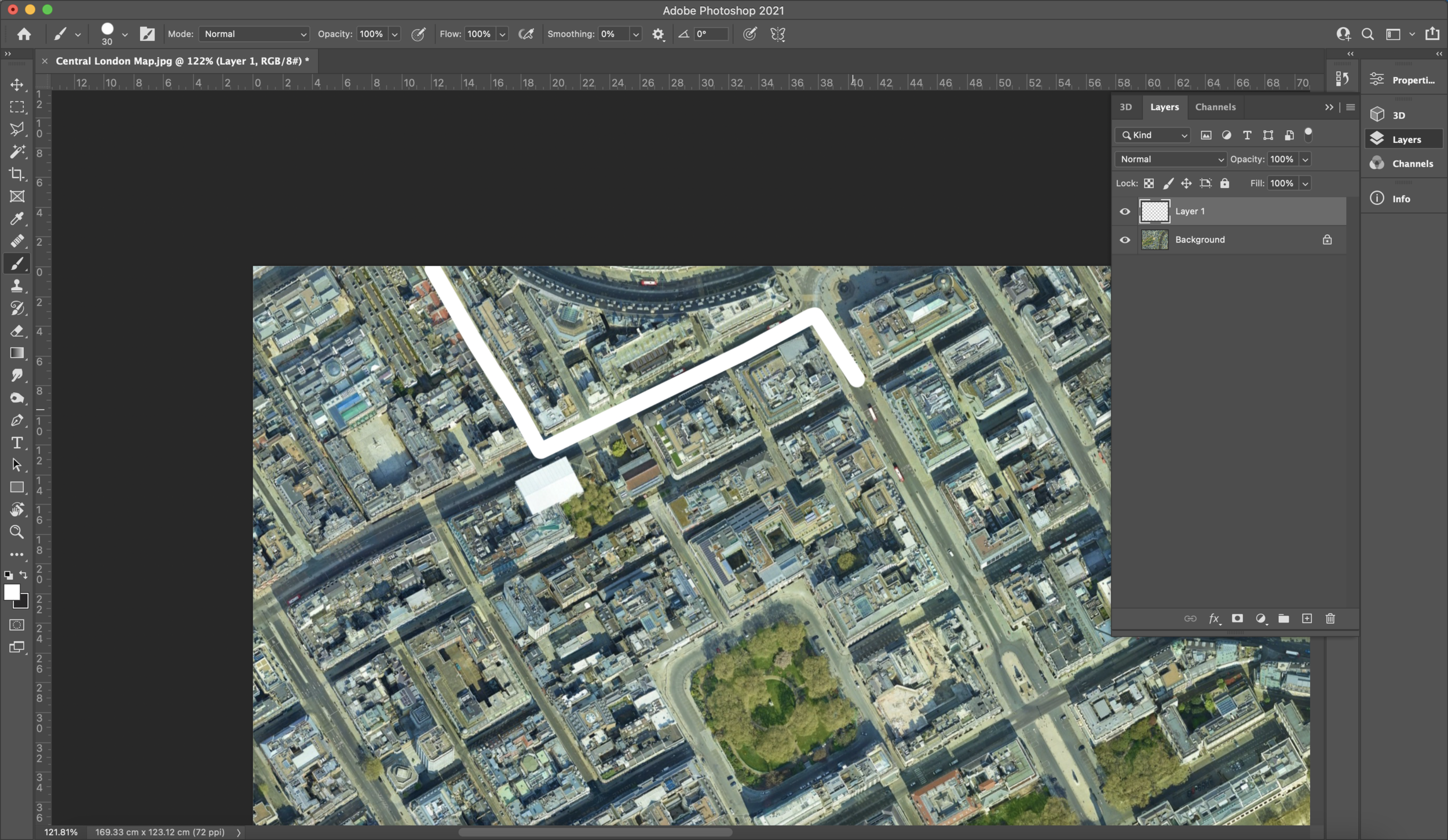
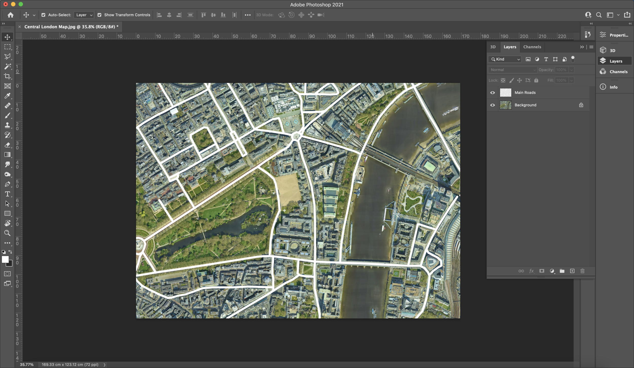
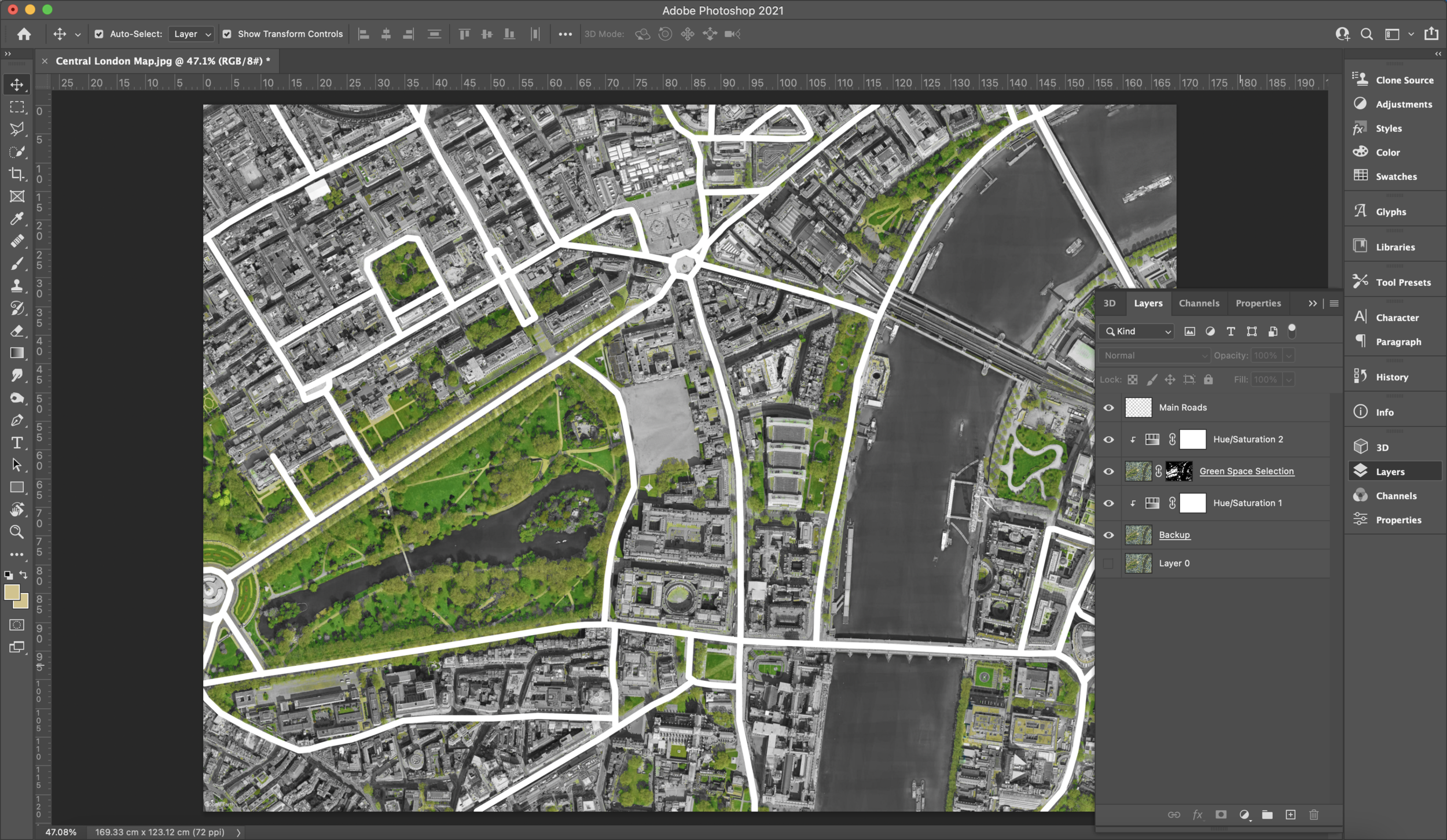
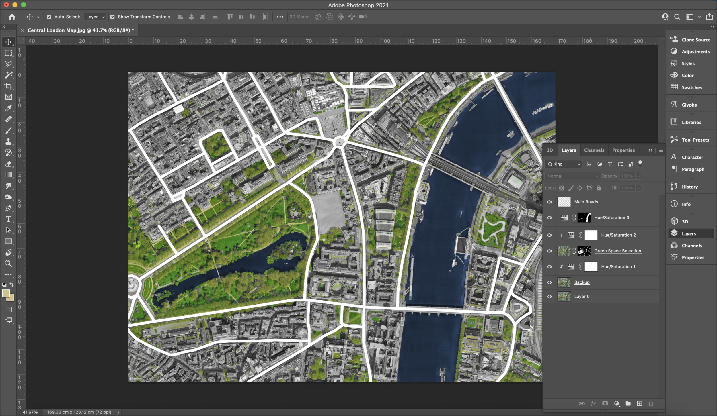
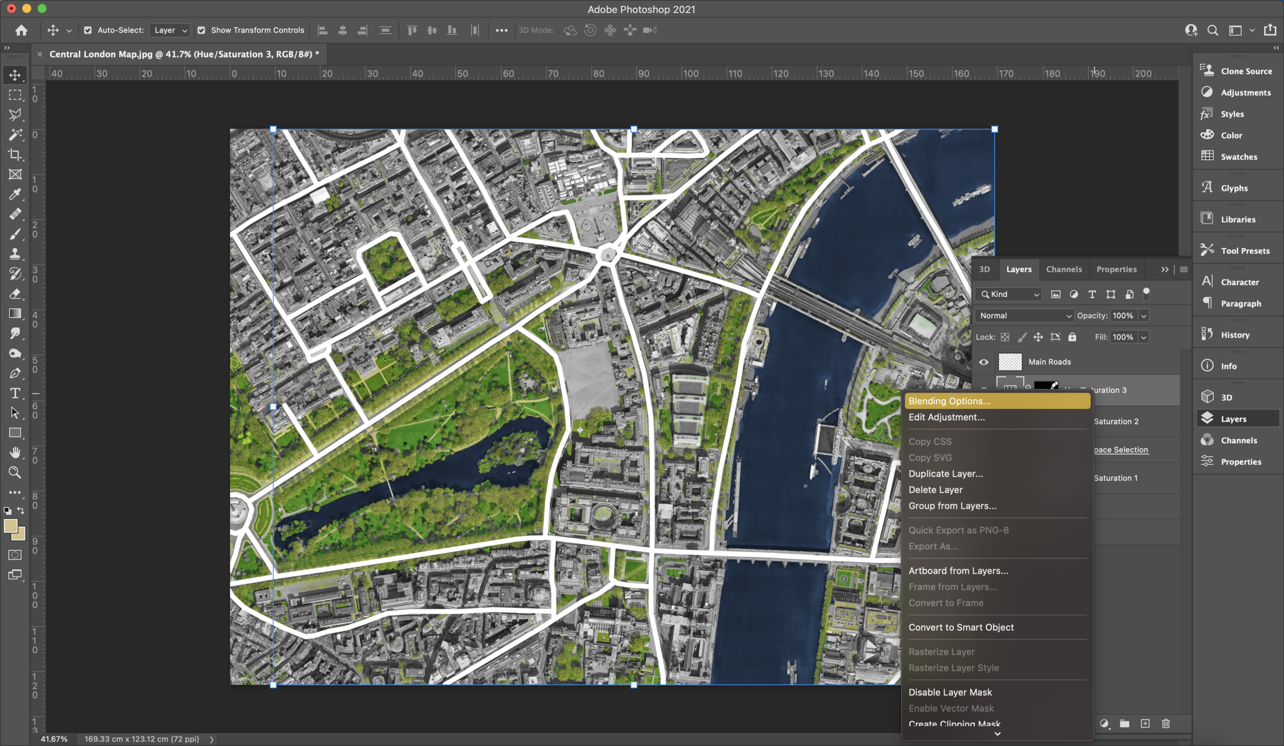
Now that we have gotten our image into Photoshop, it’s time to enhance some of the key features on a master plan such as roads, green spaces and bodies of water. You can opt for two different methods to draw the roads. You can either draw using the paintbrush tool for each component or you can use Digimaps to generate vector maps of each typology. The second option is better for documenting measurements. Again, I do not intend to use this master plan for any scale work so I have manually drawn out the main roads on its own layer. It is extremely important to work with layers. I cannot emphasise enough how much more your experience with Photoshop becomes easier.
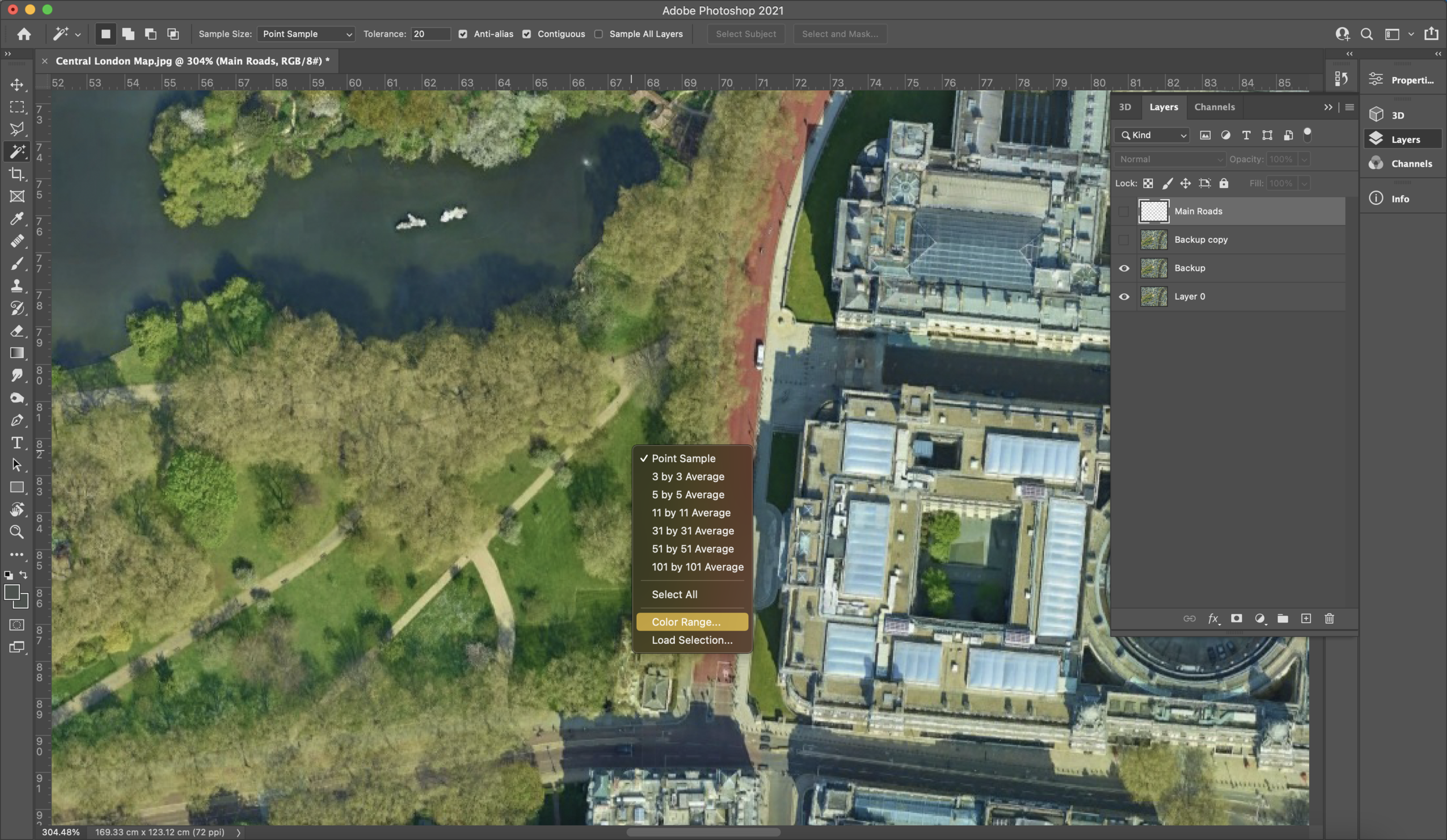
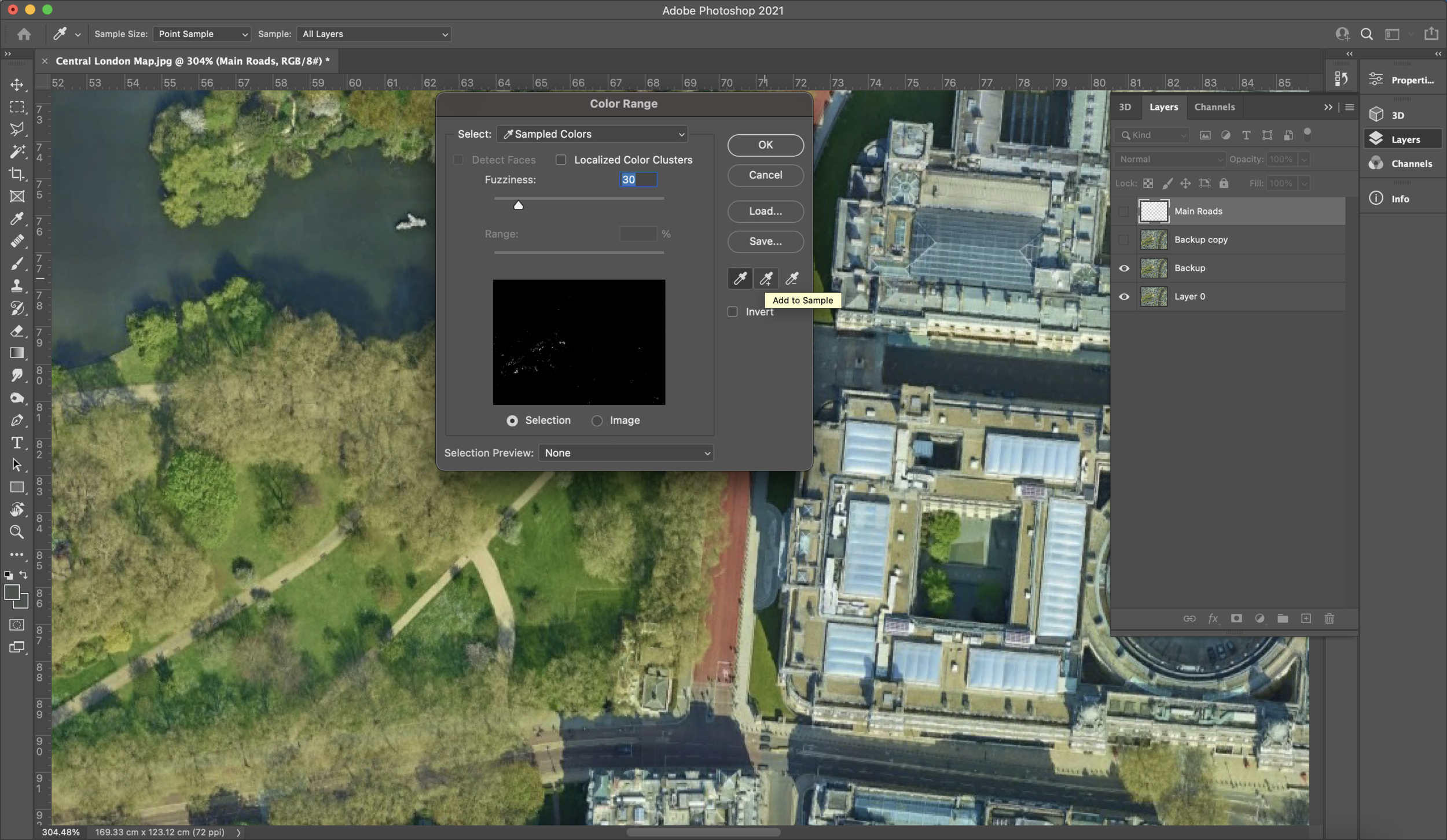
I have selected the colour white for the roads and by holding ‘SHIFT’ I started to draw over the main roads. By doing this we are also sectioning the plan into units which will be useful in the future. Once marking all of the roads, make some extra copies of the JPEG layer. If you haven’t already unlocked the JPEG, click the lock icon to unlock it and use ‘CTRL + J’ or ‘COMMAND + J’ to duplicate the image layer. Whilst on one of the duplicate JPEG layers, select the magic wand tool and right click on the JPEG. You should see a ‘colour range…’ option which is what we will be using to select our green spaces. As you can see from the screenshots below, you are faced with a pop up window which allows you to pinpoint a colour in the image. When you click on somewhere on the image, the small preview box will show you which areas have been recognised as the same colour on the image. Cool, right? Makes life so much easier. Click around multiple areas that are green since there are usually different tones amongst vegetation. Avoid selecting the shadows of the trees since it's likely that it is the same tone as buildings and other shadows we do not need. If you accidentally click on an area you want to unmark, you can undo or use the same tool with a ‘-’ next to it to deduct it from the selection. Once you are happy with what the preview window shows you can click ‘OK’.
Next, using the mask tool, mask the layer. As you can see from my image, some sand tones were also picked up that were recognised in both green spaces and elsewhere. To remove such areas, I used the quick selection tool with a ‘-’ to deselect the unwanted sections.
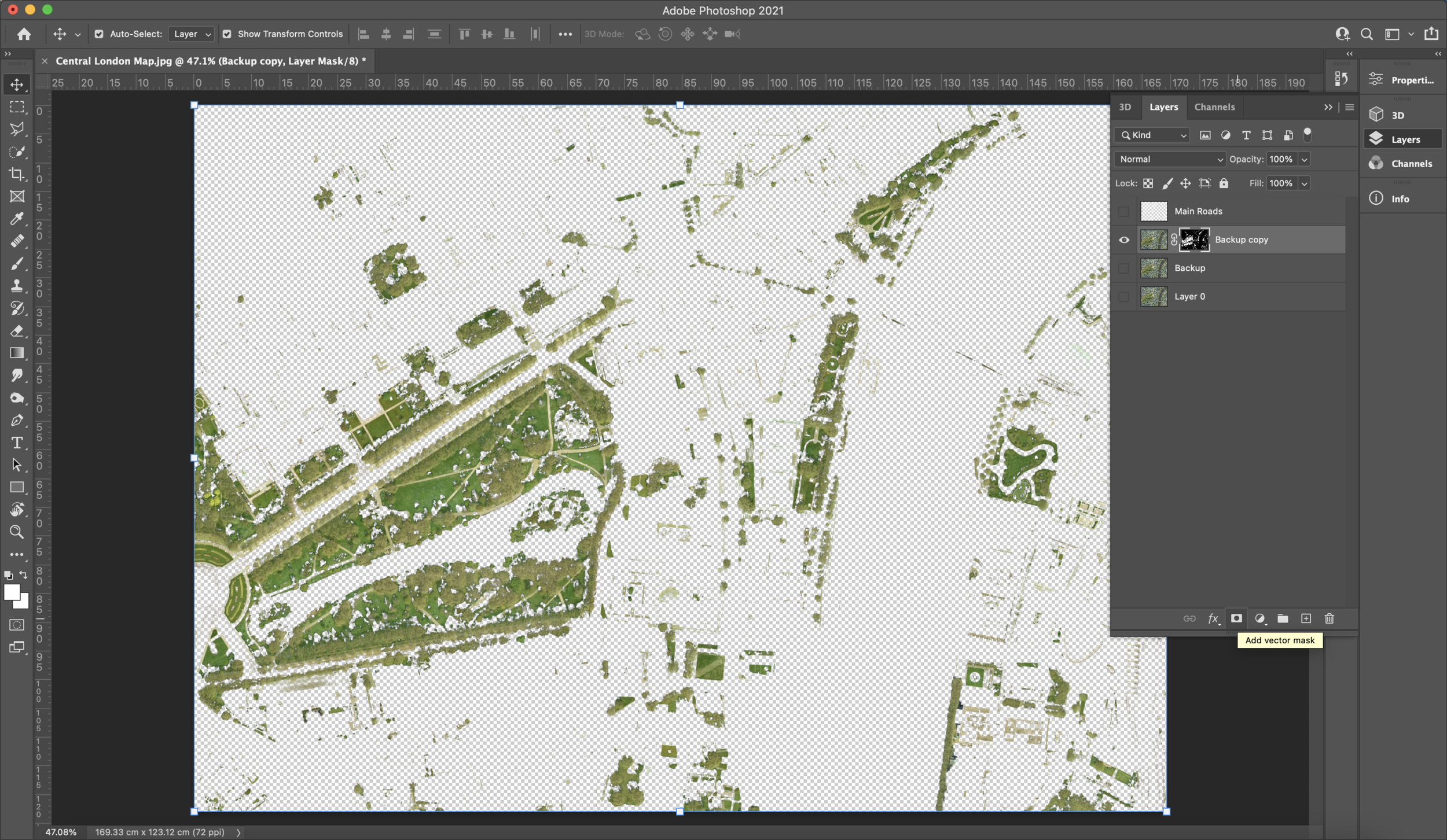
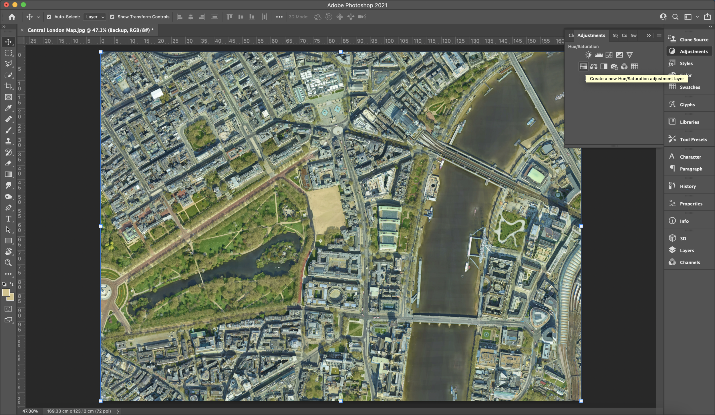
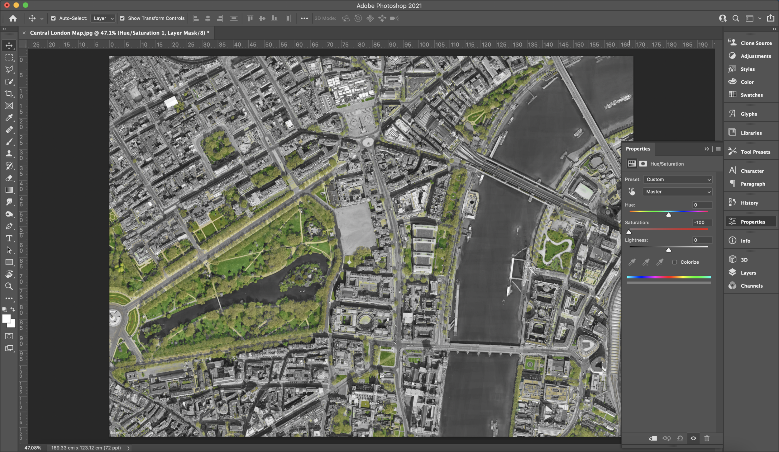
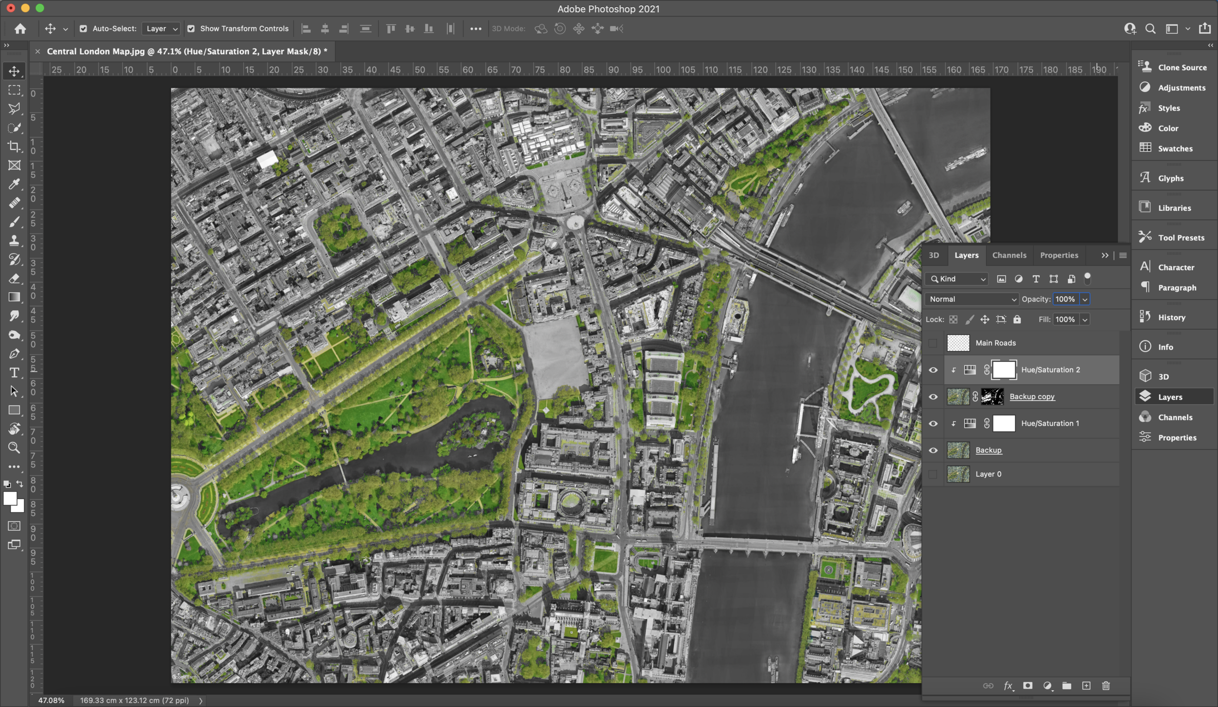
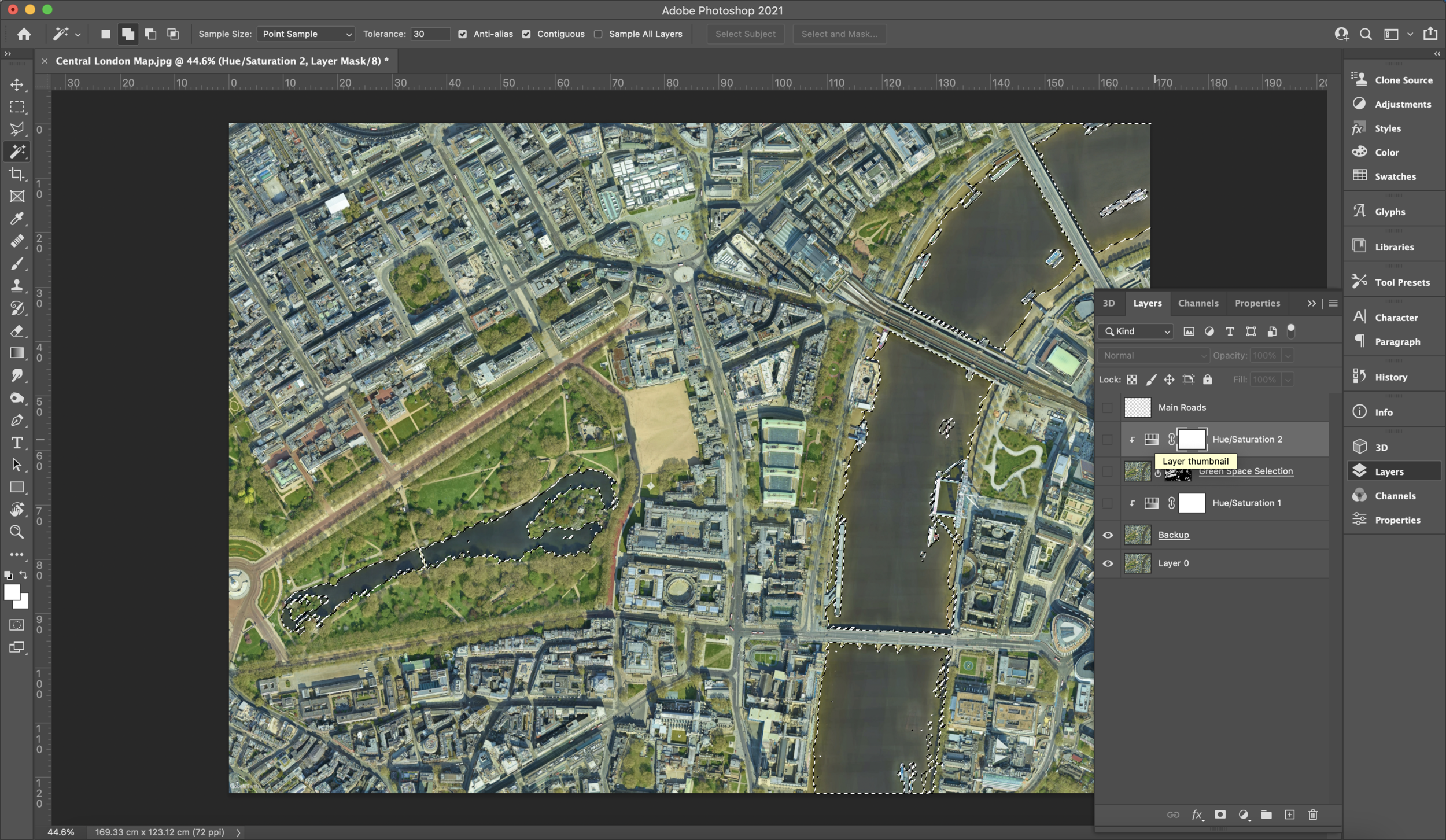
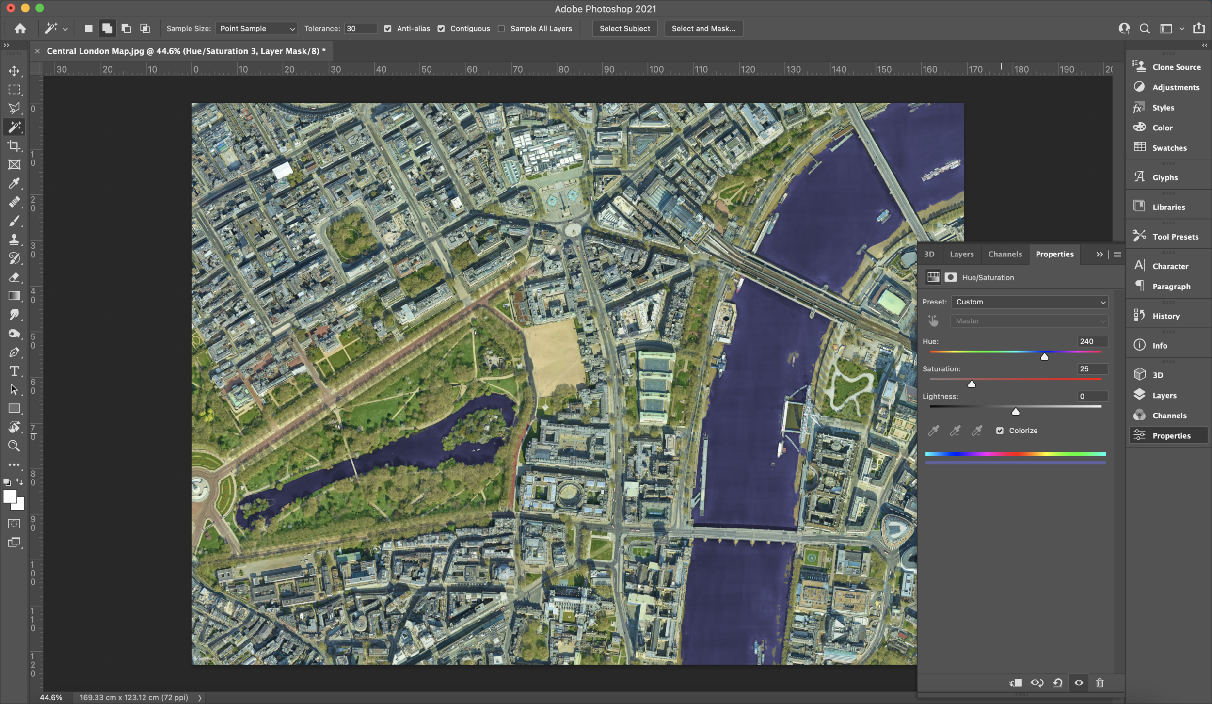
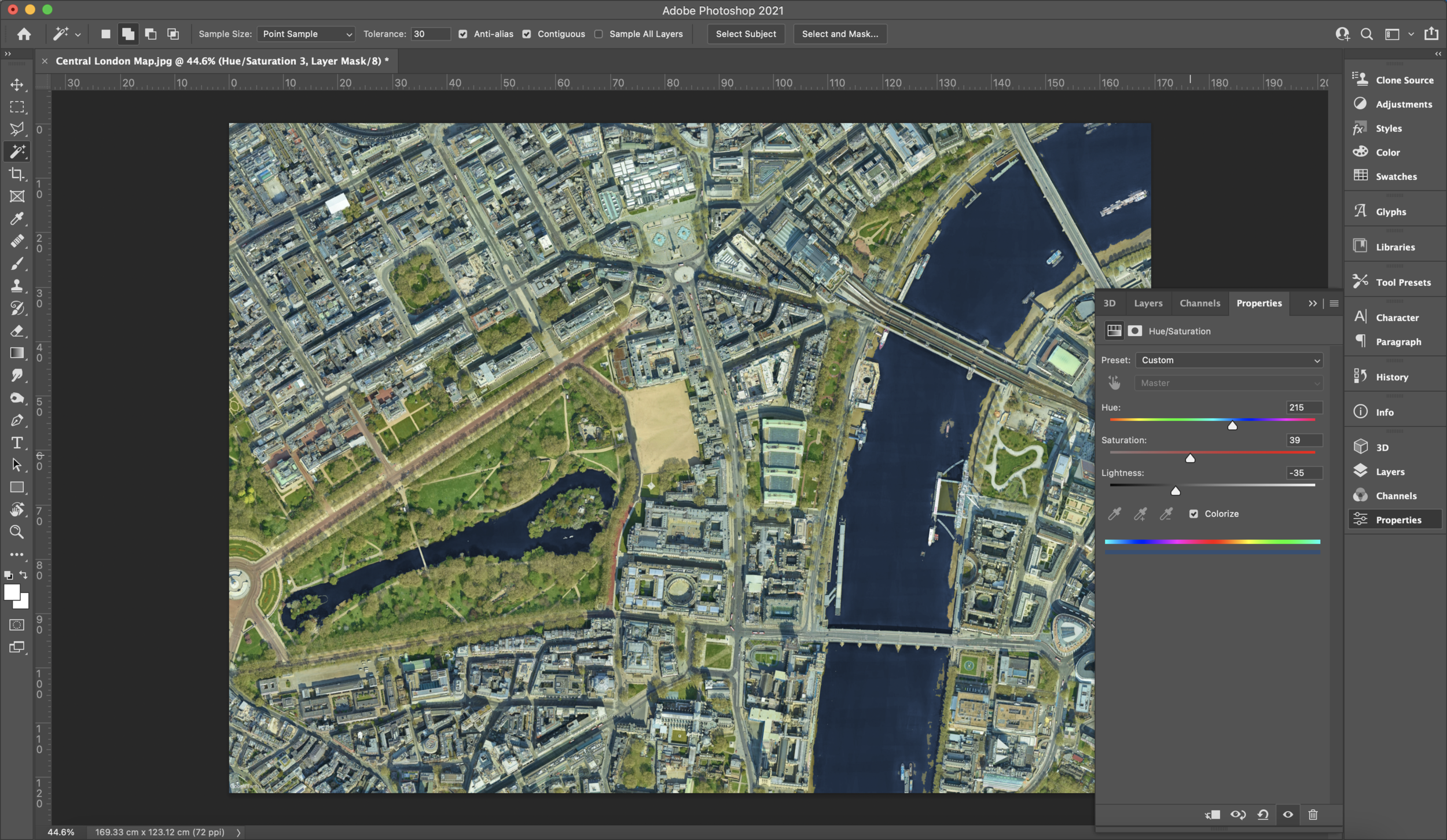
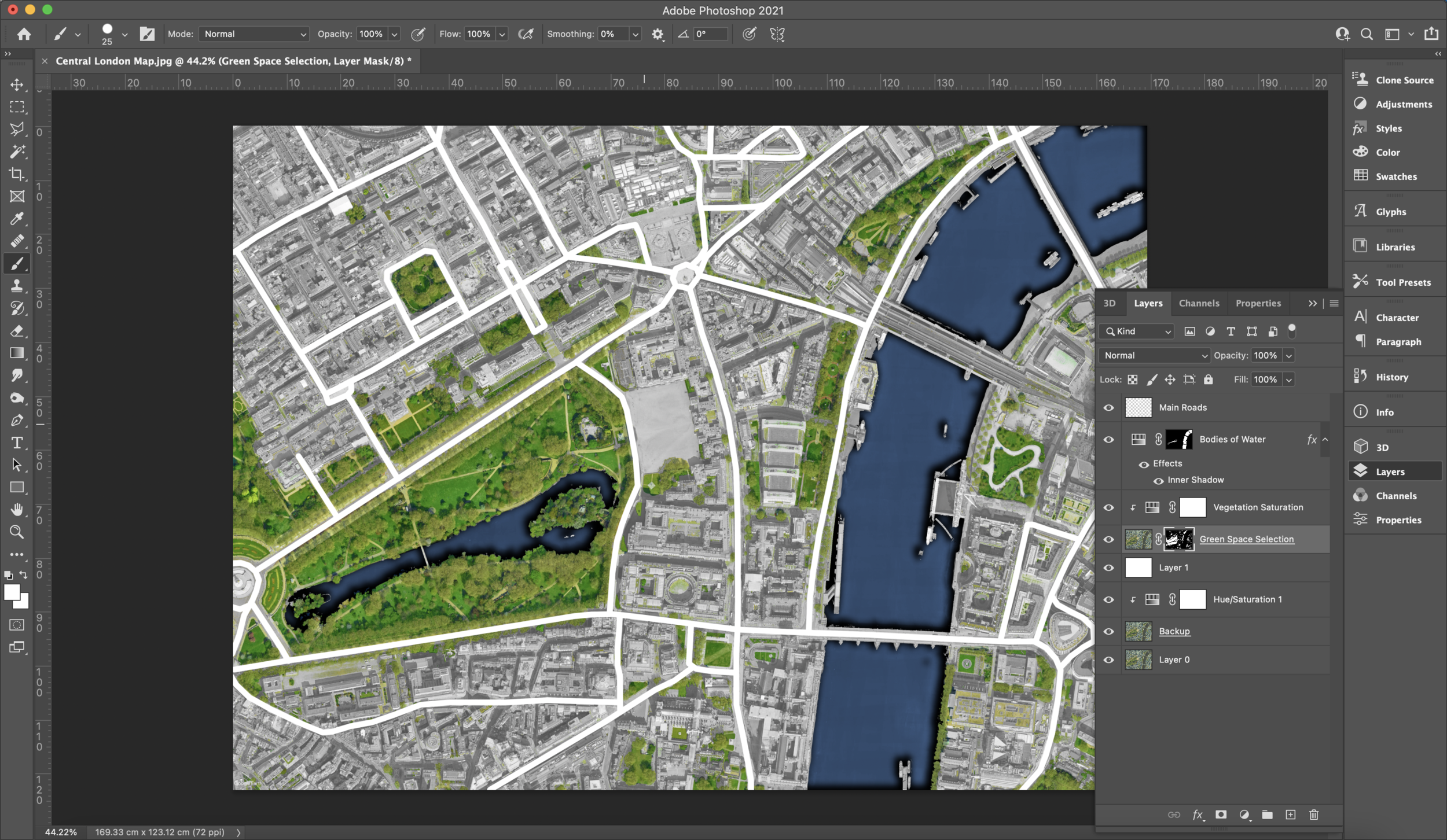
What we want to do next is create a hue/saturation adjustment layer whilst on the backup JPEG layer and in our properties window, lower the saturation to 0 in the hue layer. You will see now we have a monochromatic image besides the green spaces. To link this hue/saturation adjustment layer use the shortcut ‘CTRL + ALT + G’ or ‘OPTION + COMMAND + G’. You will see an arrow next to the layer that’ll show it’s linked. Create another hue/saturation layer that's linked to the green spaces layer so we can make the vegetation pop out using the same process as we did for the JPEG layer. You do not have to stick to a green colour at all, go wild with a different colour palette if you want!
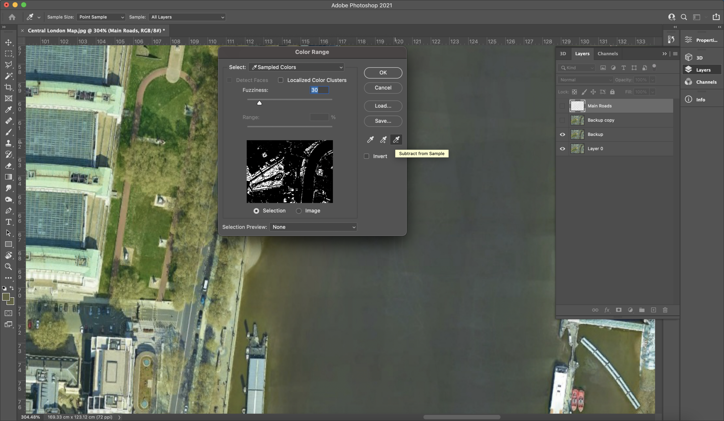
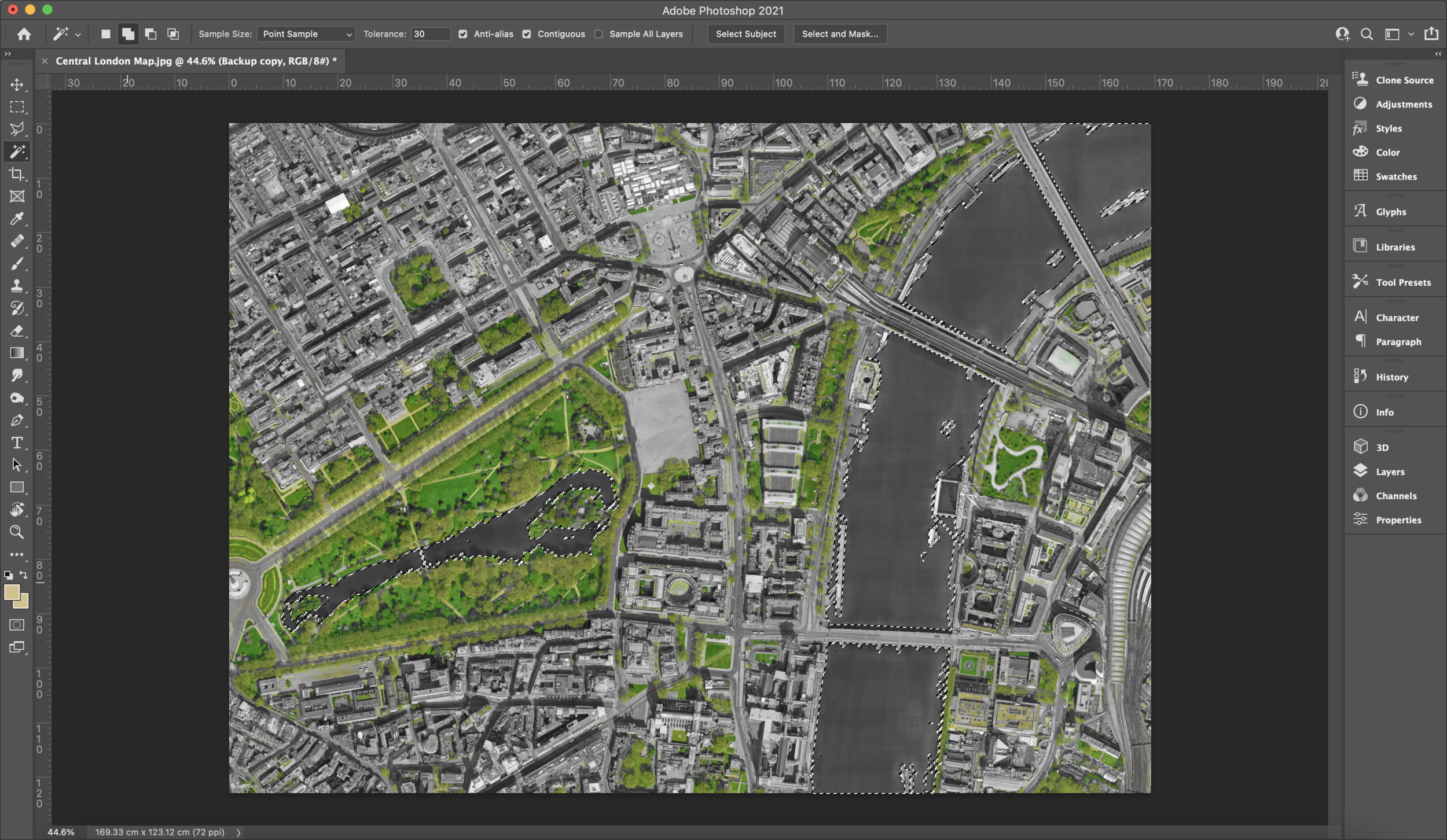
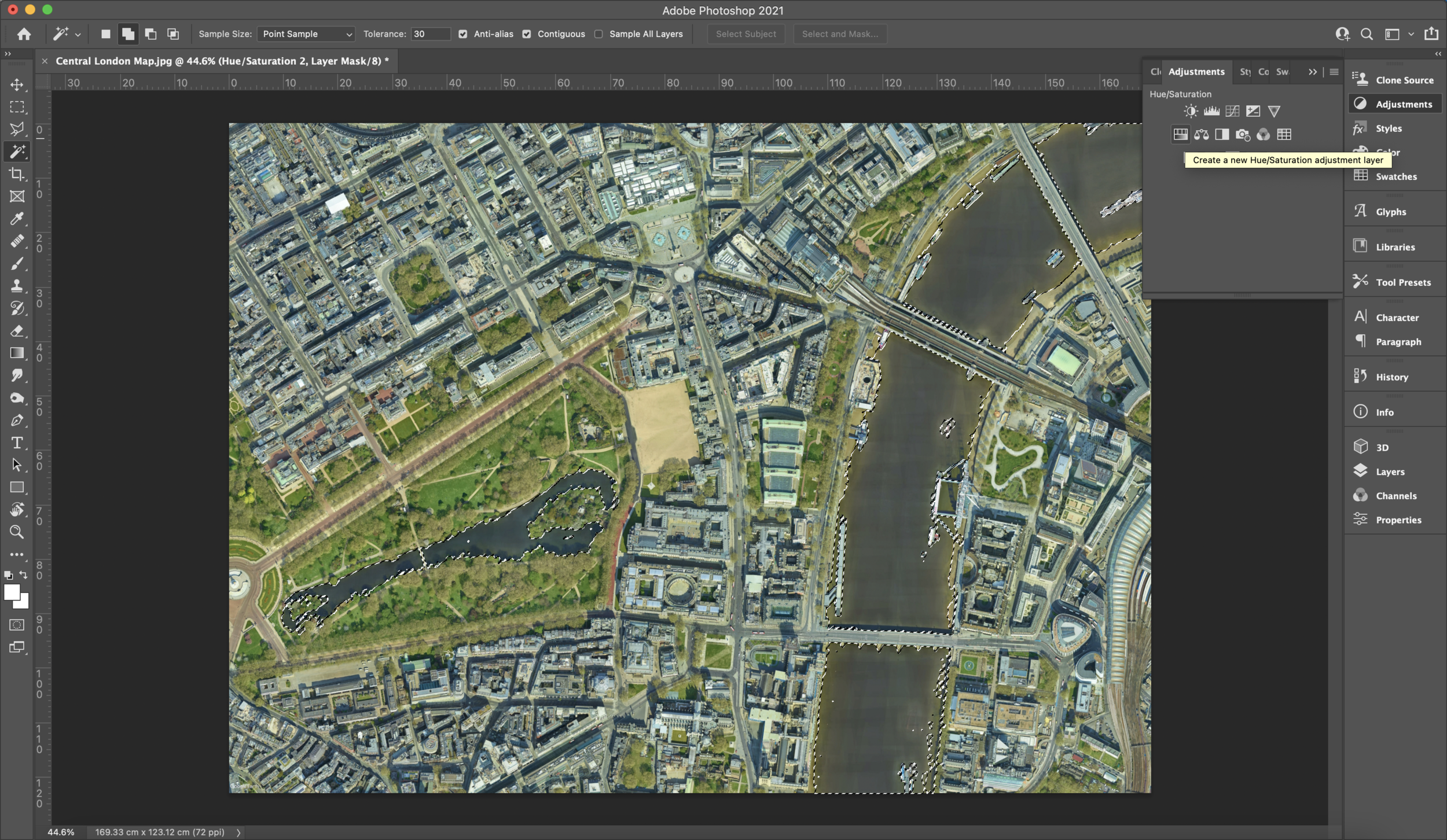
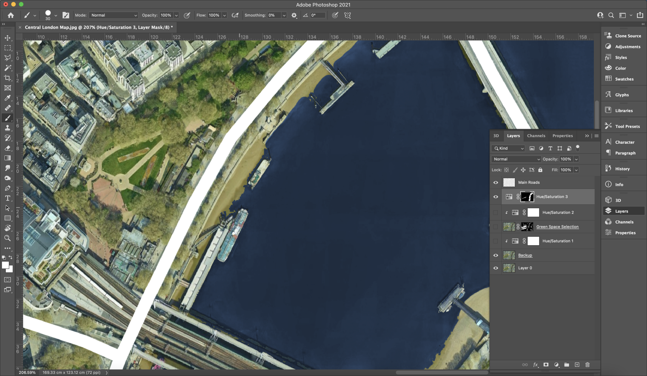
Now using your magic wand tool, whilst on our JPEG layer, select all the bodies of water you have. Try to get as much as it selected through the magic wand but we’ll fix the selection of other areas later. Go back to your adjustments window and create another hue/saturation adjustment layer. Make sure the layer is below the roads but above the other hue/saturation layers. In your properties window, you can play around with the lightness, saturation and hue for your bodies of water. Make sure to have ‘colourise’ on or you won’t see any colour changes. Once you have decided, we can go back to the layer that has masked out our bodies of water. Using any paintbrush tool, start to neaten and brush over any areas that were missed or need fixing which your magic wand wasn’t able to pick up on.
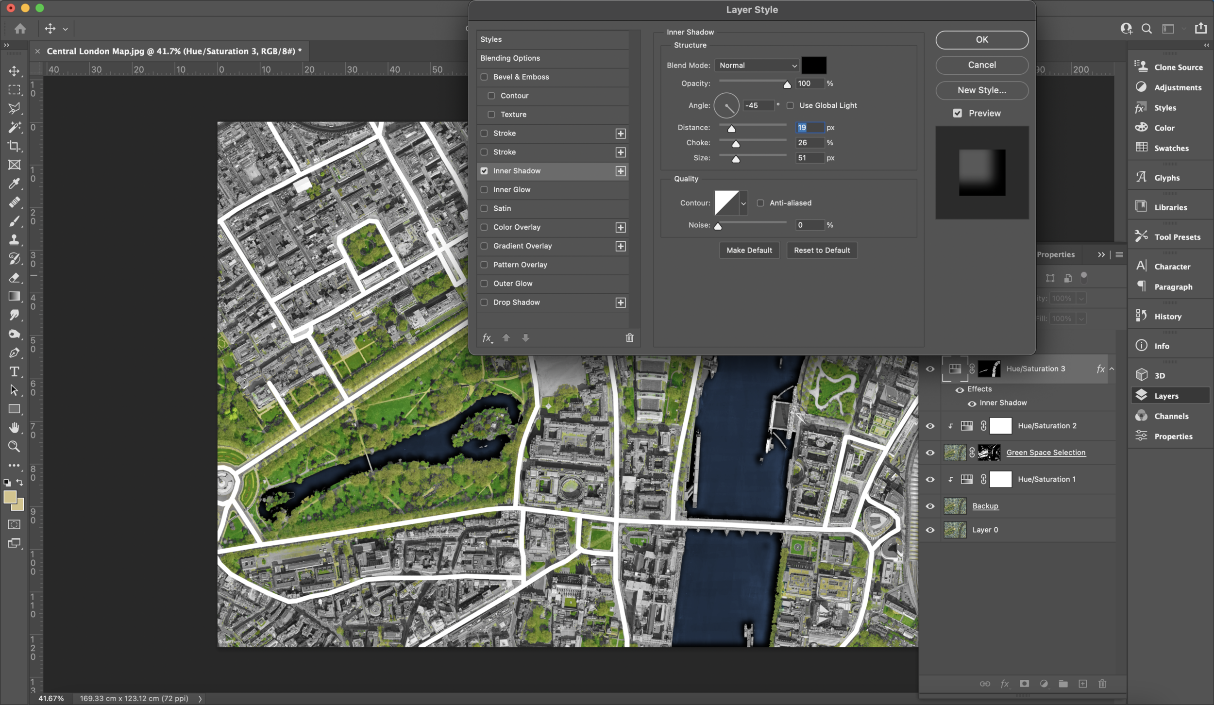
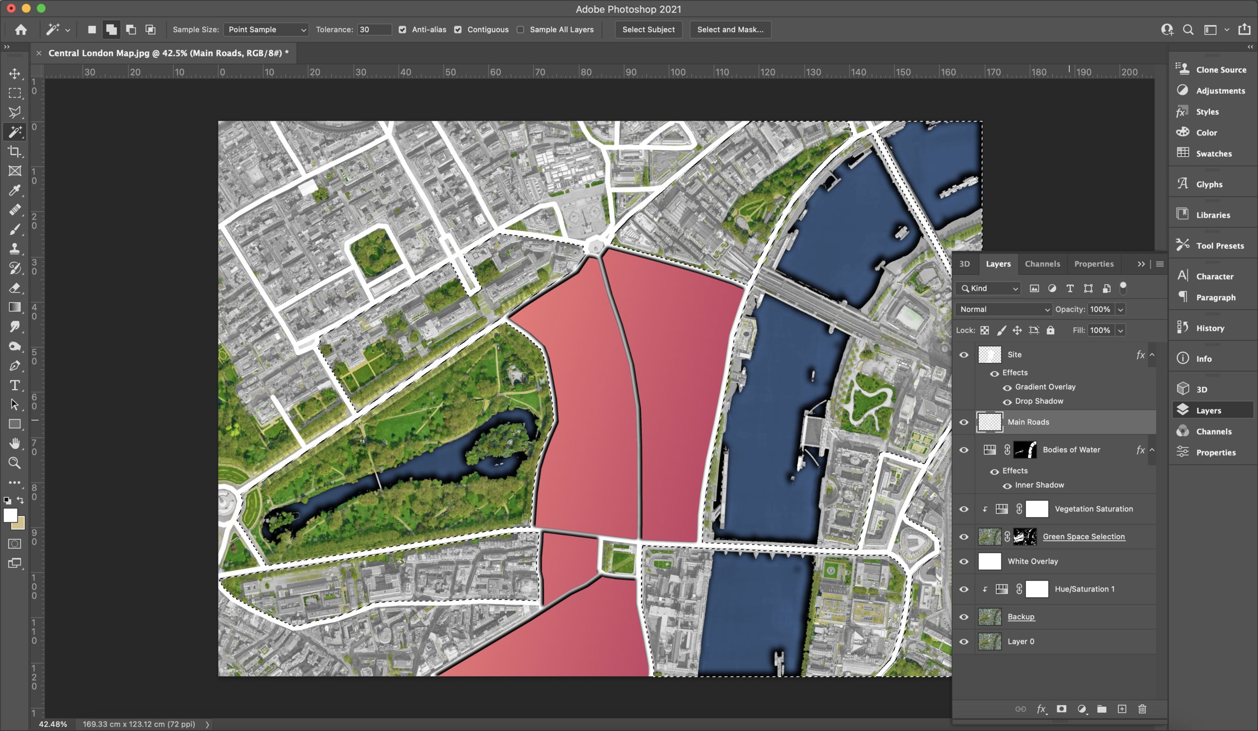
Next we are going to use the magic of shadows (it wouldn’t be a Sude tutorial if she didn’t bang on about shadows) to add some depth. Right click on your bodies of water layer and select blending options. Here we are going to switch on the ‘inner shadow’ and add some shadow for our waters. Shown on the screenshots below, here are the settings that I have used but you can opt for your own since this is up to preference. Just remember what angle you have used because we are going to need that later on.
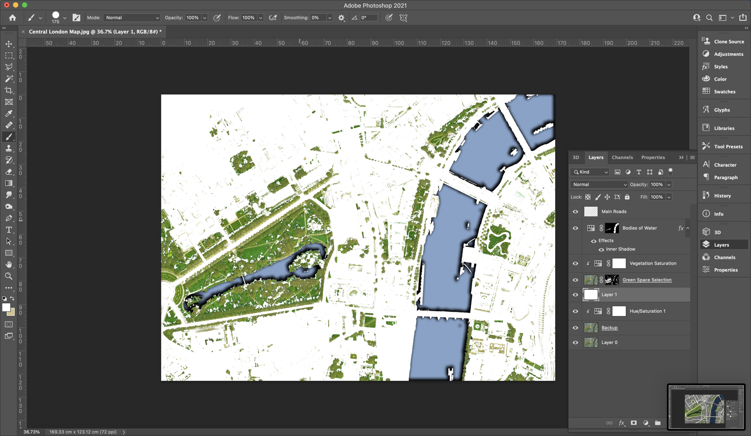
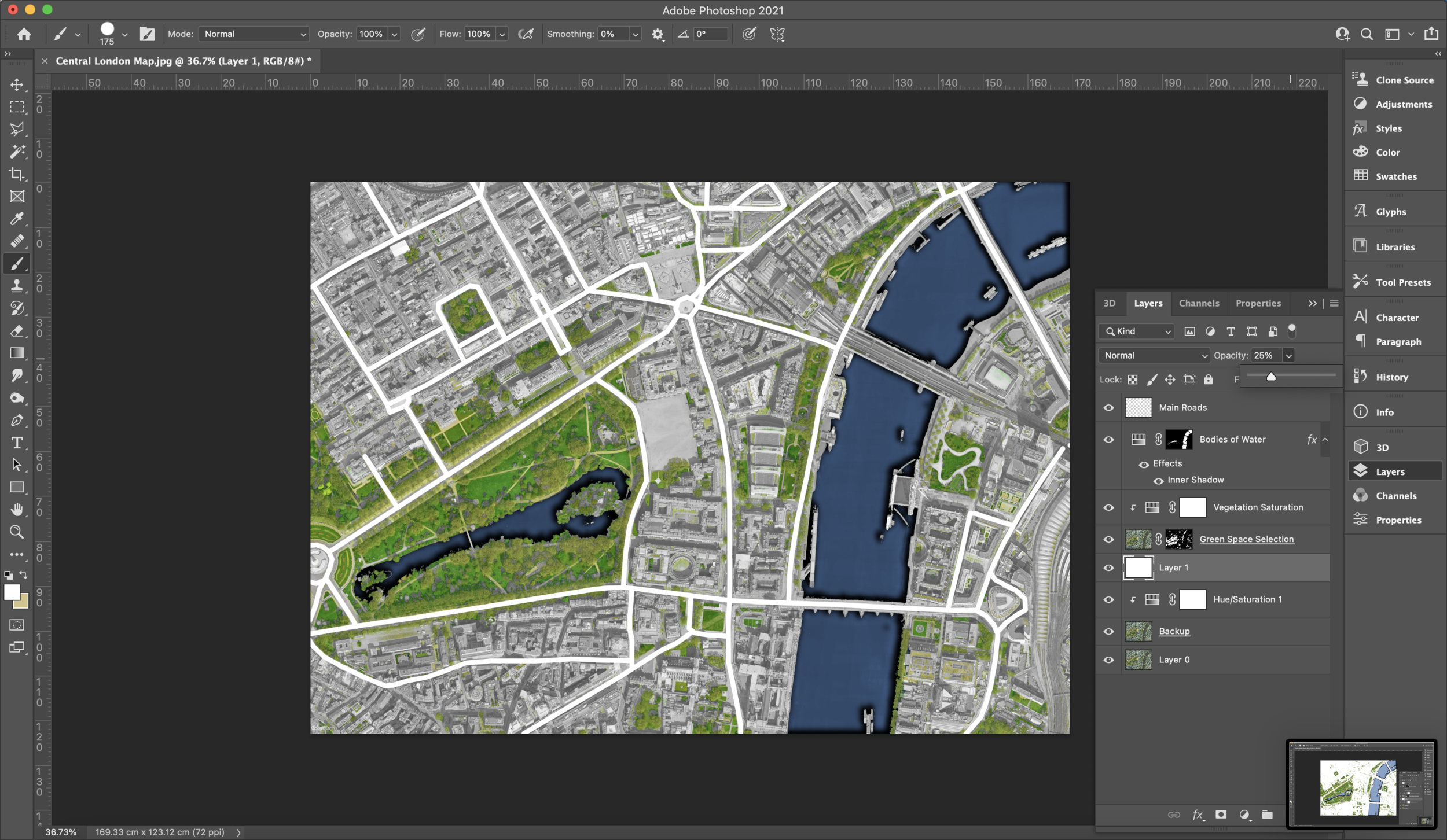
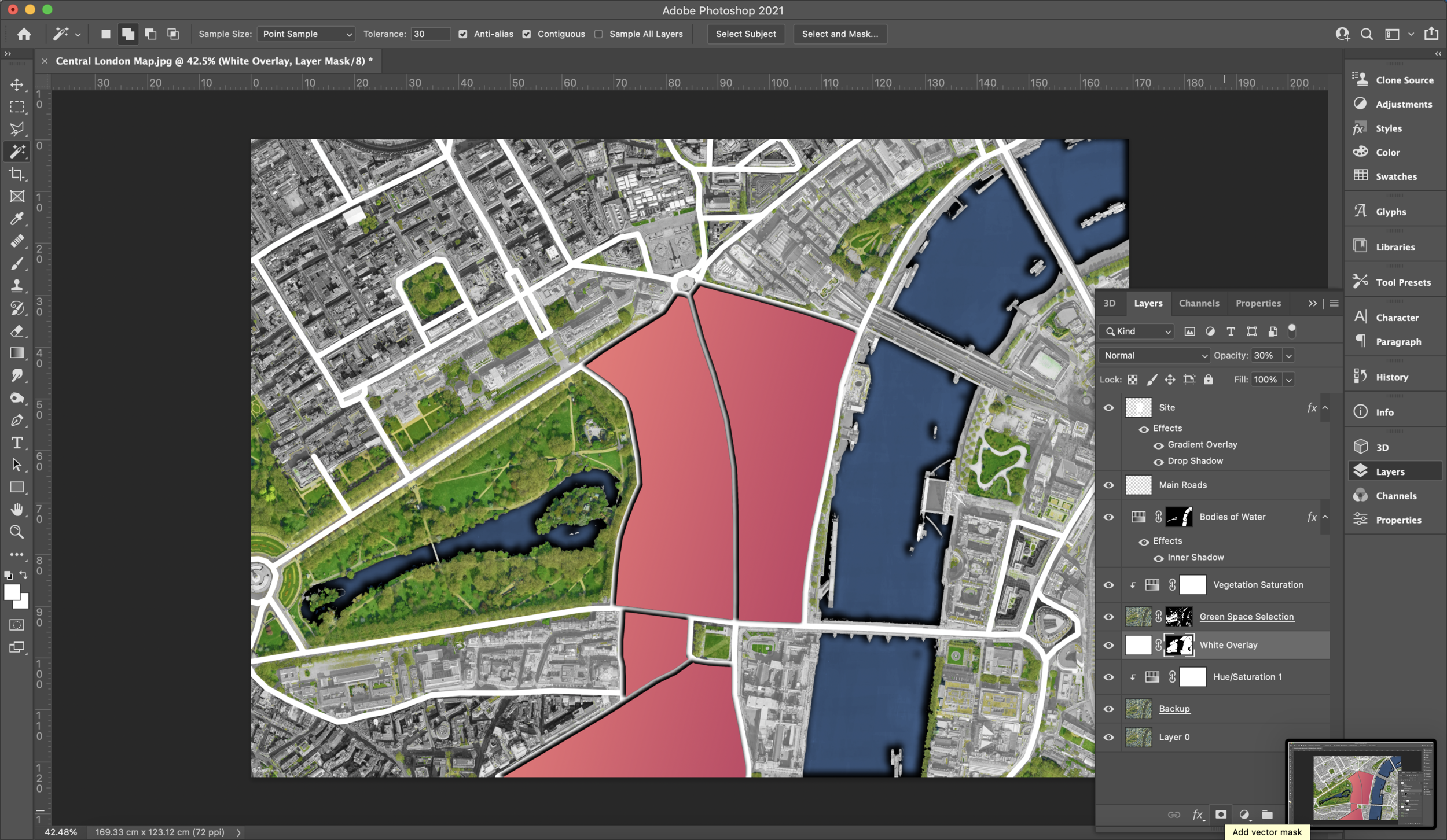
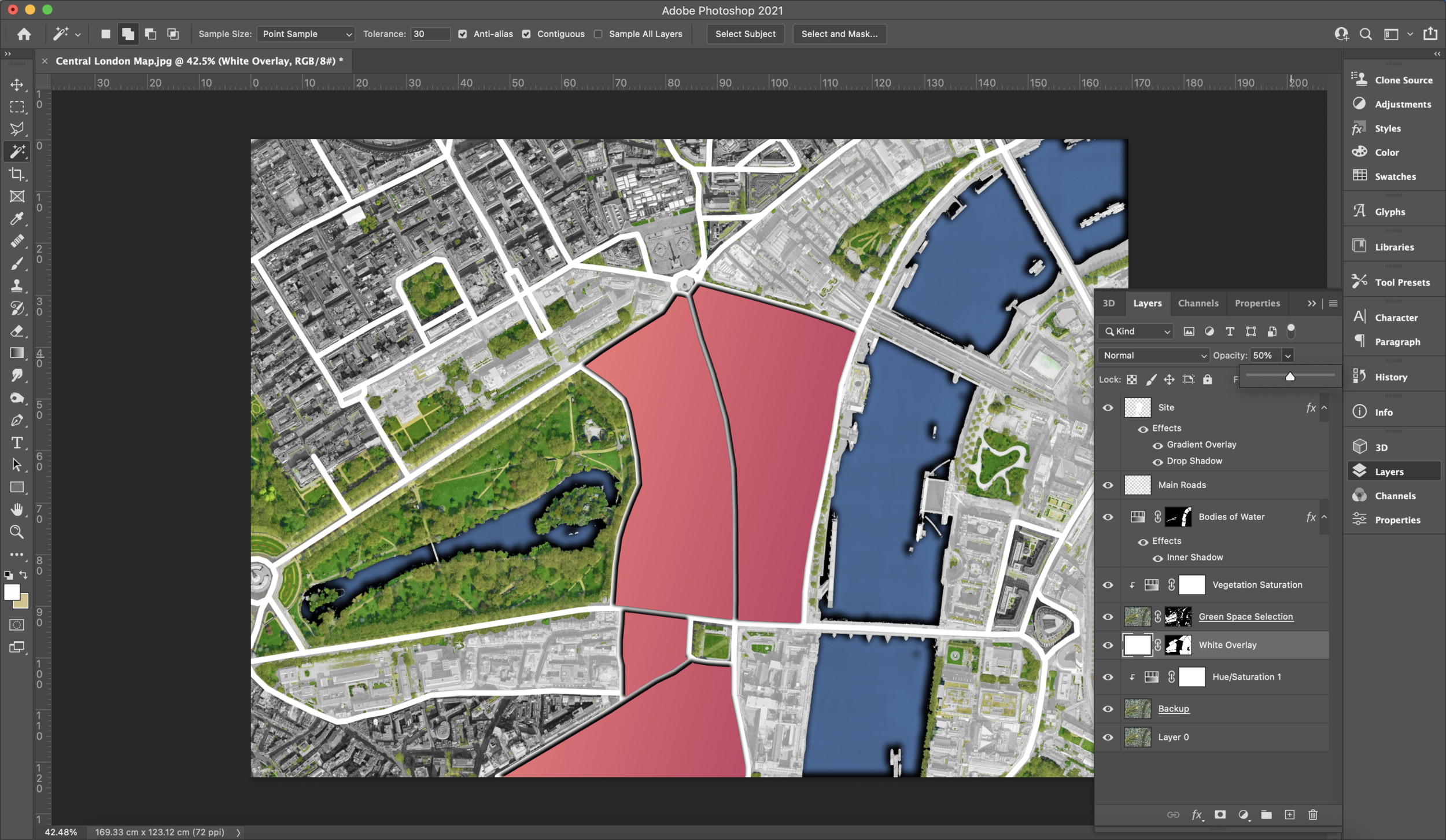
We now want to create a white layer that’ll go across the whole plan. Create a new layer and press your ‘ALT + BACKSPACE’ or ‘OPTION + BACKSPACE’ keys to fill the layer with your foreground colour which should be white. Lower the opacity to something around 20-50%. Since we hadn’t selected our tree shadows previously, go in with any type of brush whilst on the mask layer for our green spaces and go over all your tree/vegetation shadows. This is done so our white overlay does not affect shadows.
4. Marking Proposal Site/Areas
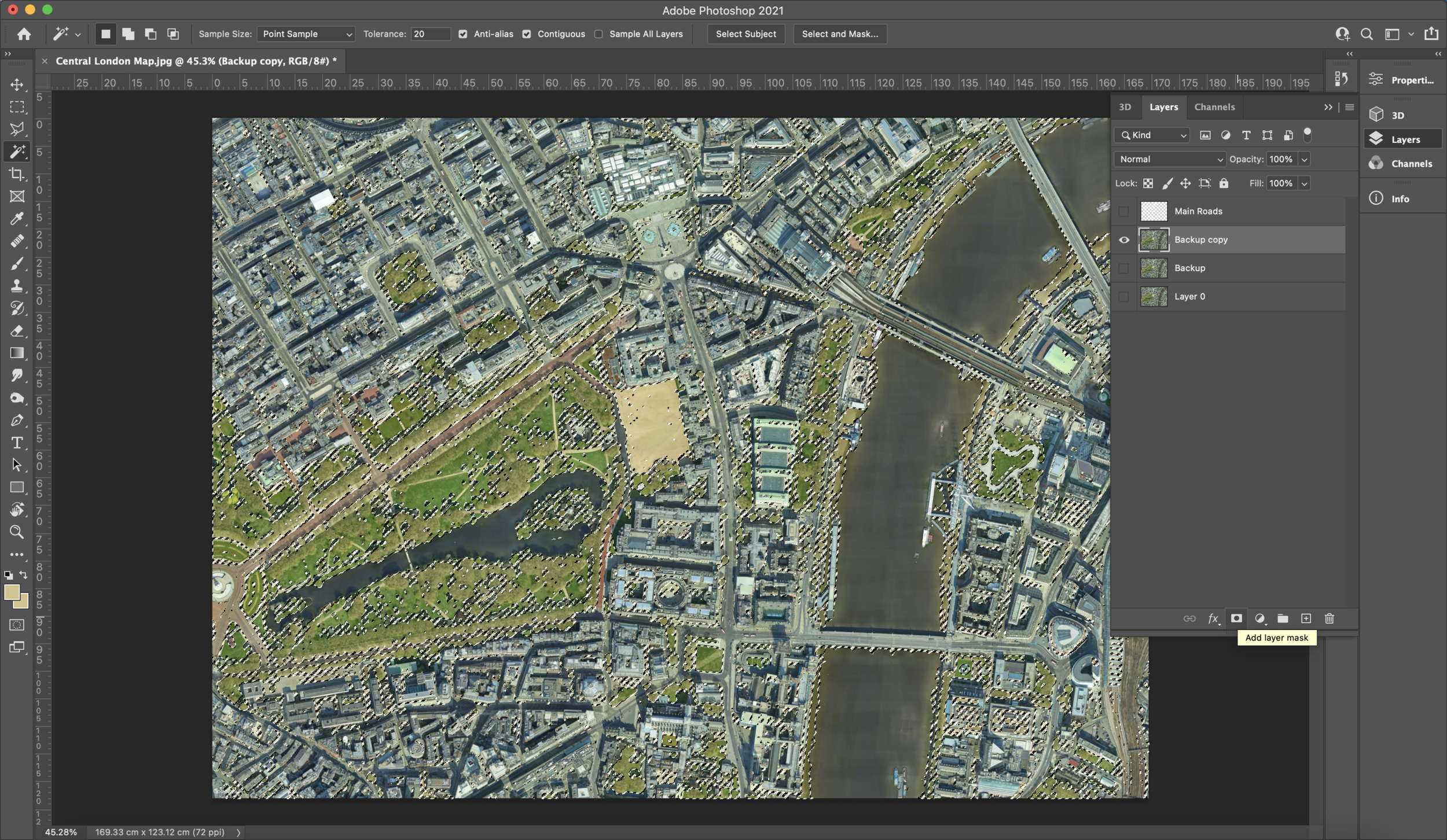
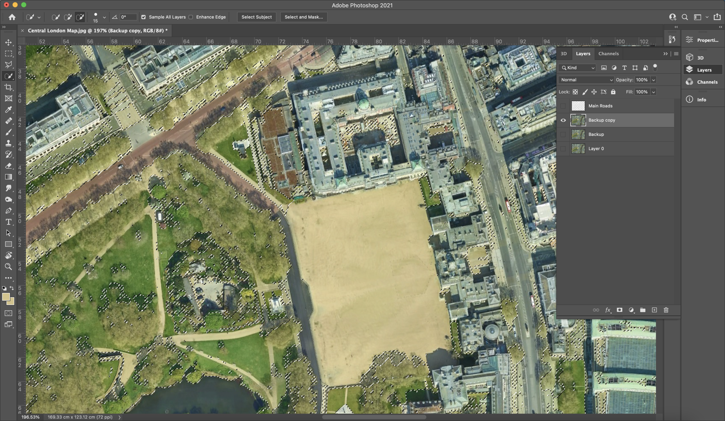
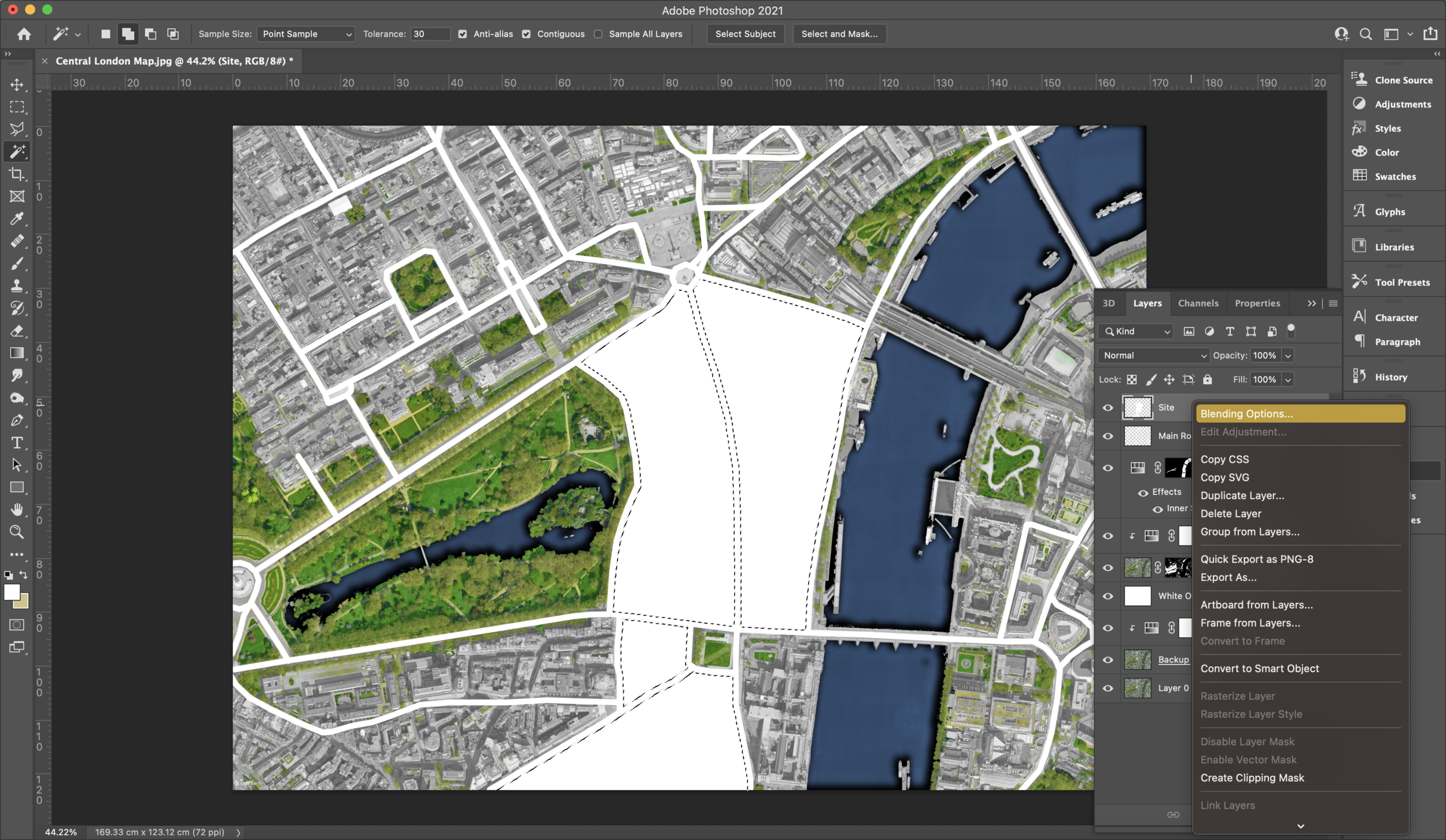
It’s likely that you’ll want to mark out some specific areas on the map, like your site. This is where our road layer is going to come in handy. The road layer would have sectioned off blocks of buildings for us which means we can select sections of buildings using the magic wand tool. Whilst on your road layer, use the magic wand to select specific areas but before you use ‘ALT + BACKSPACE’ or ‘OPTION + BACKSPACE’ make sure to create a new layer. Those selected areas should now be filled in white which means we are ready to go into our ‘blending options…’ window again to add colour and depth to these volumes. The rest is up to preference.
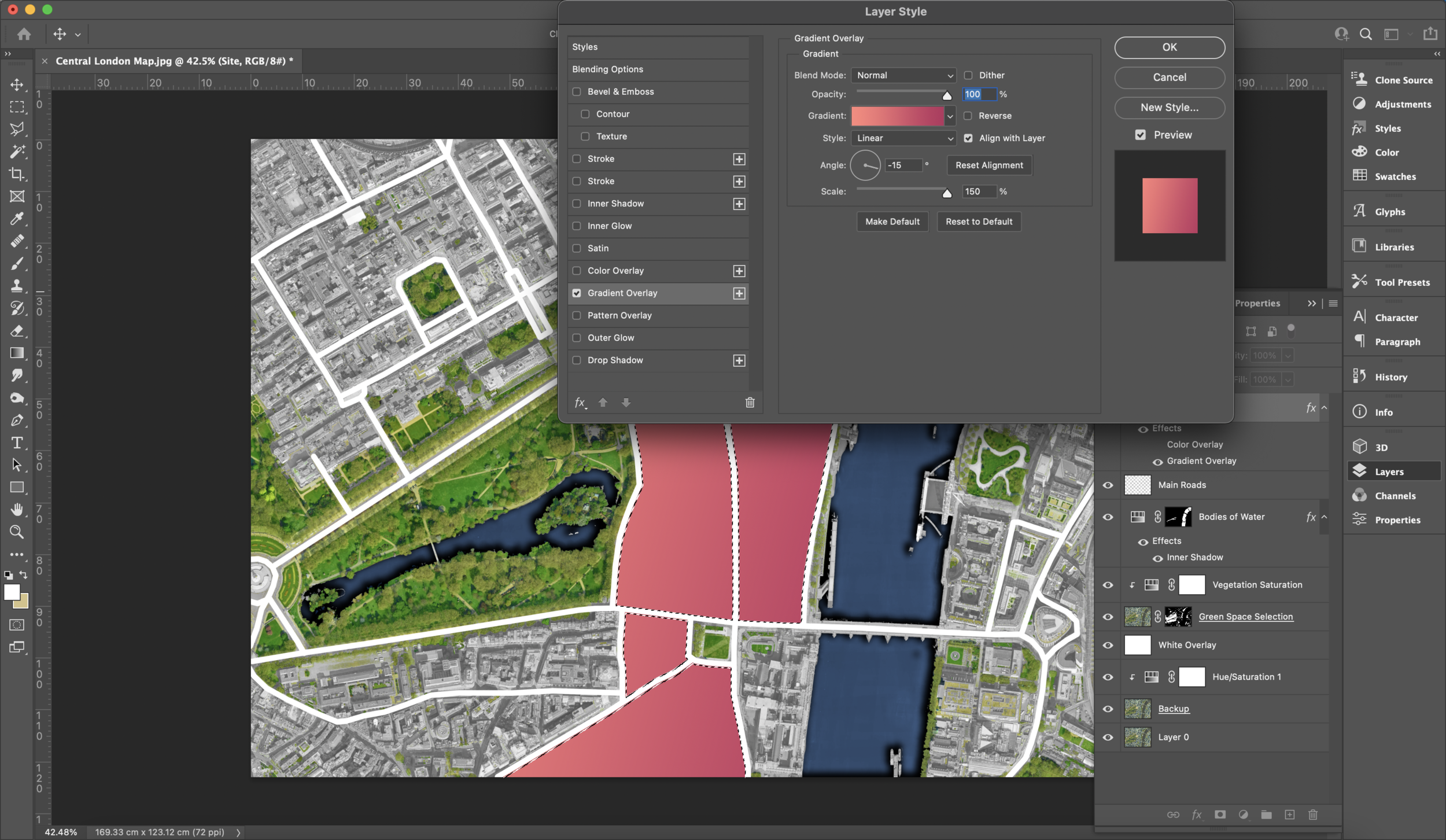
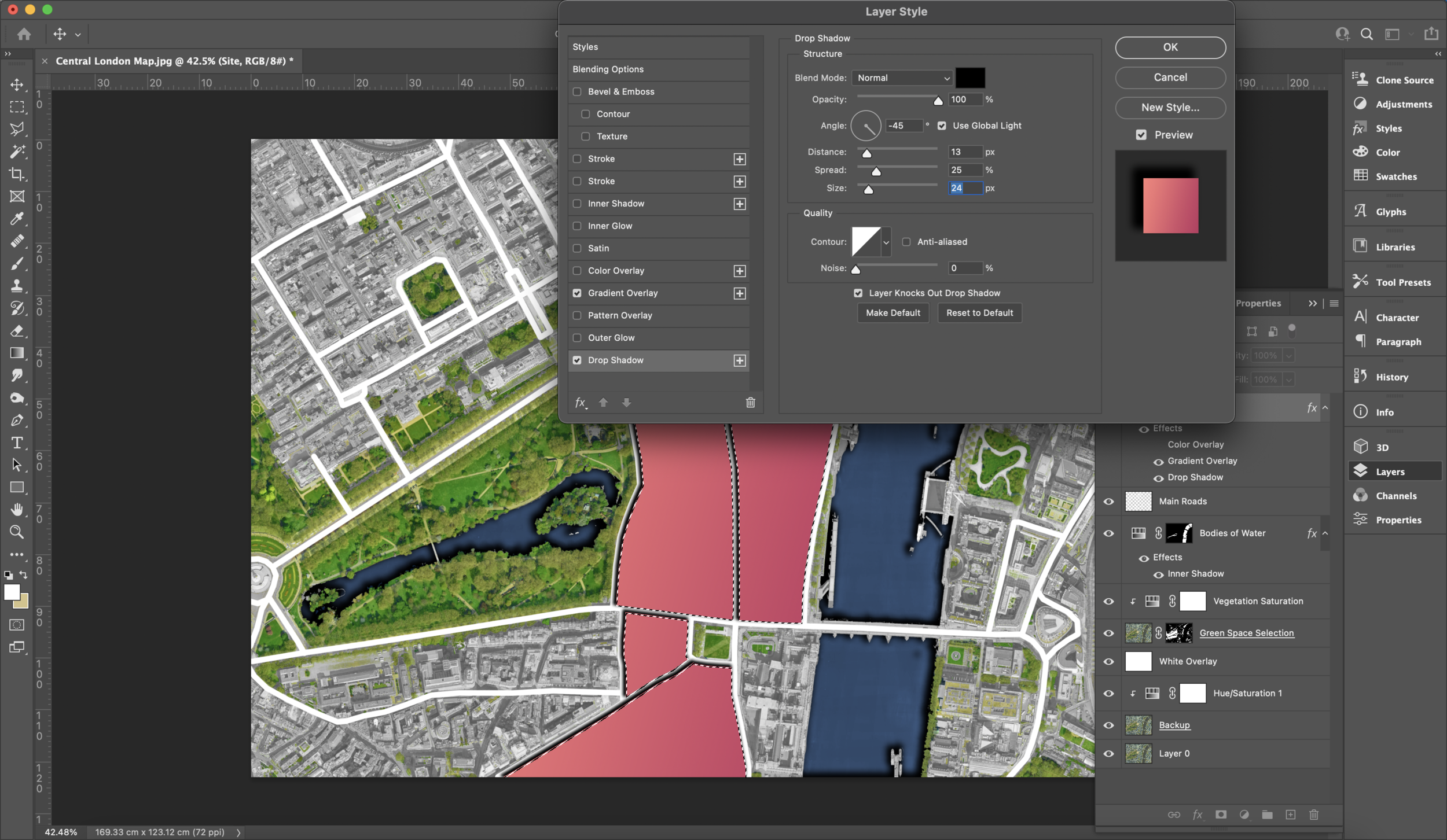
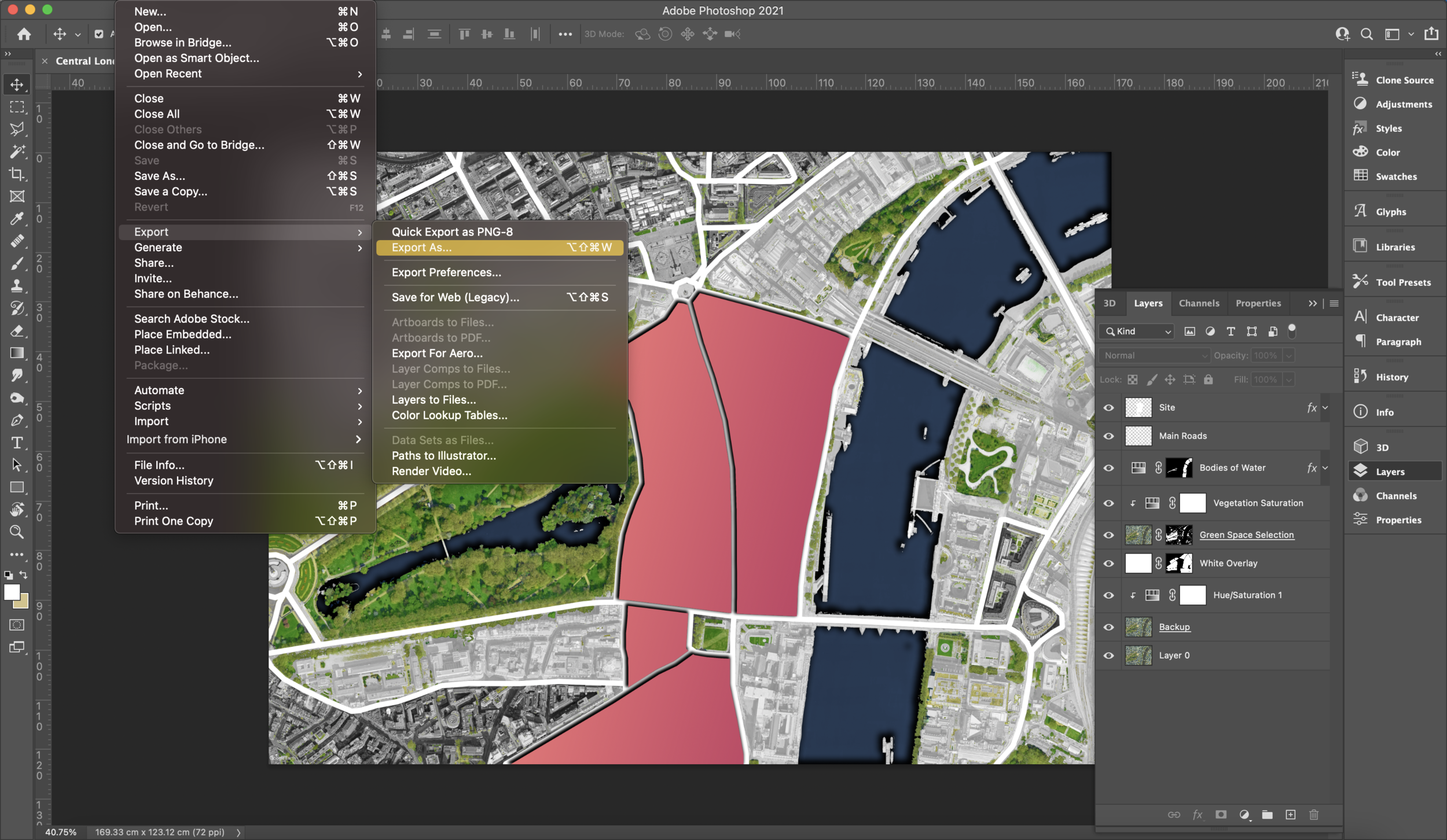
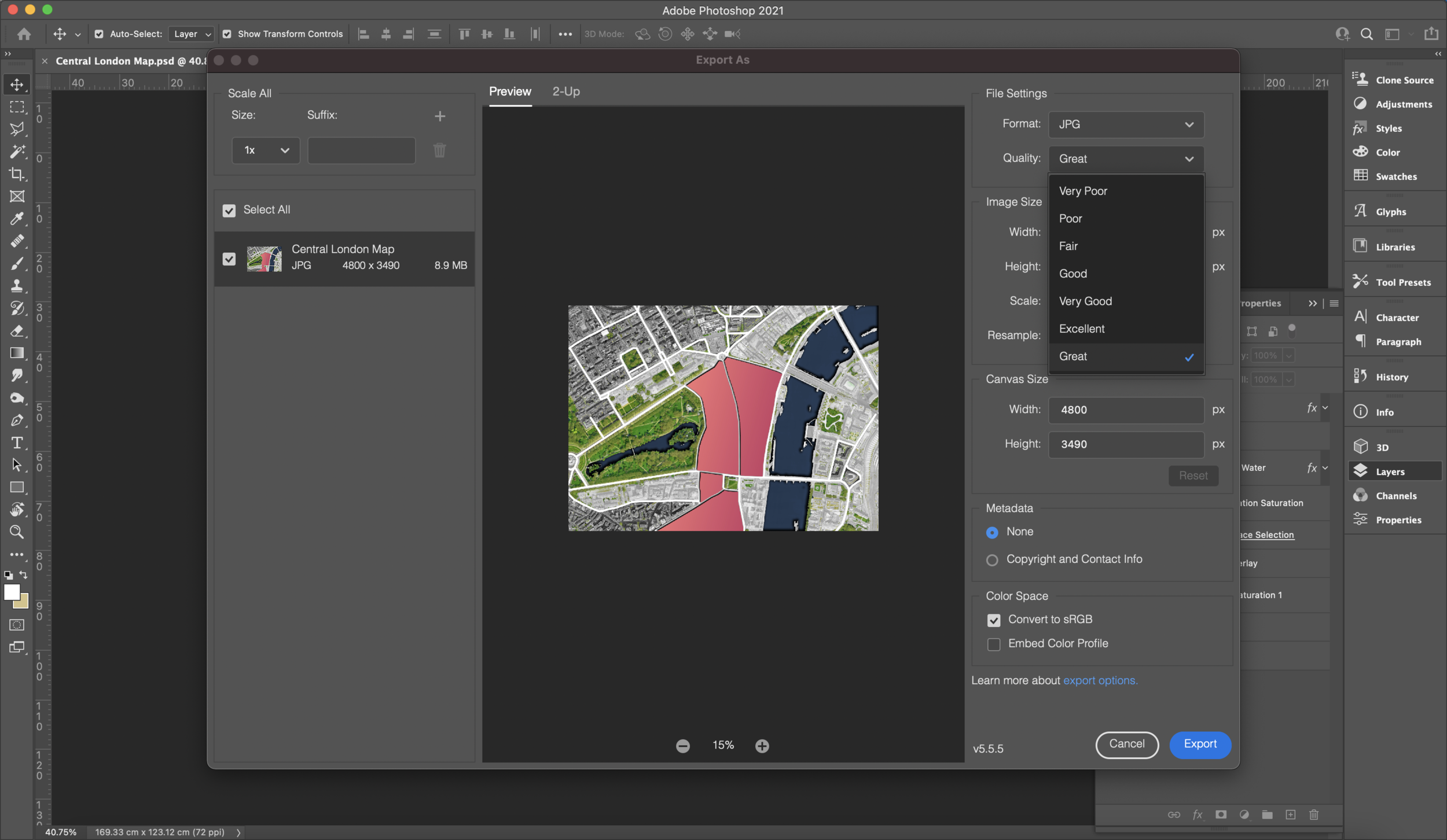
I’ve chosen to use a red/orange tones gradient for my selected block of buildings but you can opt for a colour block fill or a pattern through the corresponding options. Like we added shadow before, you can also switch on the ‘drop shadow’ options and apply a shadow with the same angle to add depth. Additionally, we can also draw attention to other areas by removing the white overlay from some blocks of buildings. To do this, we can select the areas through our roads layer and once happy move to the white overlay layer and add a mask. Then you are left with what you can see below. From here on you have a well equipped master plan with the basic information. Exporting instructions are shown below in the screenshots. We opt for JPEGs since they maintain the quality of our photos. Choose your highest quality option for the best outcome!
And that’s it!
That brings us to the end of this week's blog post! Thank you for the help I received through the youtube video about creating master plans by @learnupstairs
Many of the steps you will see are from the same video but they do go further ahead with textures so make sure to go there for the rest! The techniques used in the video were extremely helpful in speeding up the process which initially could have taken very long.
This was my adaption and feel free to share yours through Instagram by tagging us @archidabble and using the hashtag #dabblefeature so we can see your creations!
See you on Monday for our next Instagram post. In the meantime, check out our CAD store filled with many freebies :)